Visual Flow Designer Process Details
- Ideation
- Interaction design
- Information Architecture
- UX Research
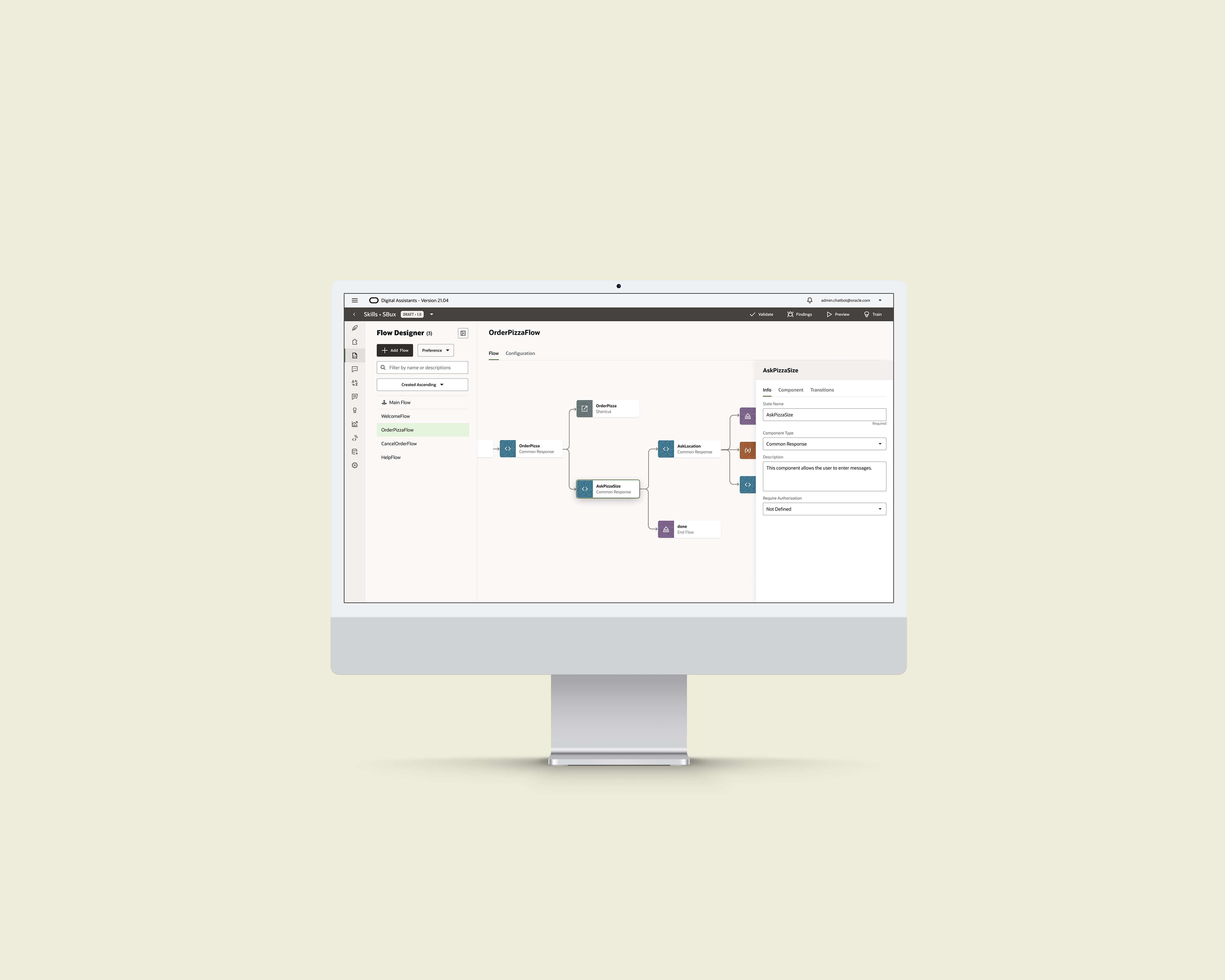
Our goal for this project is to build a new, scalable authoring system that can replace YAML. Meanwhile, I understand tech debts of YAML will bring some impact on the migration experience of existing customers, backend support, and so on. I listed the high level design challenges as below:
- YAML is hard to manage as it grows longer and longer.
- Current users cannot quickly track conversation branches in YAML editing.
- YAML's high learning curve prevents users with less coding knowledge from authoring chatbots.
- We need to help current customers migrate existing YAML authored skills to Visual Flow Designer.
- We need to leverage the current backend ability (that originally supports YAML) and design a visual authoring UX around that.
Ideation & Early Research
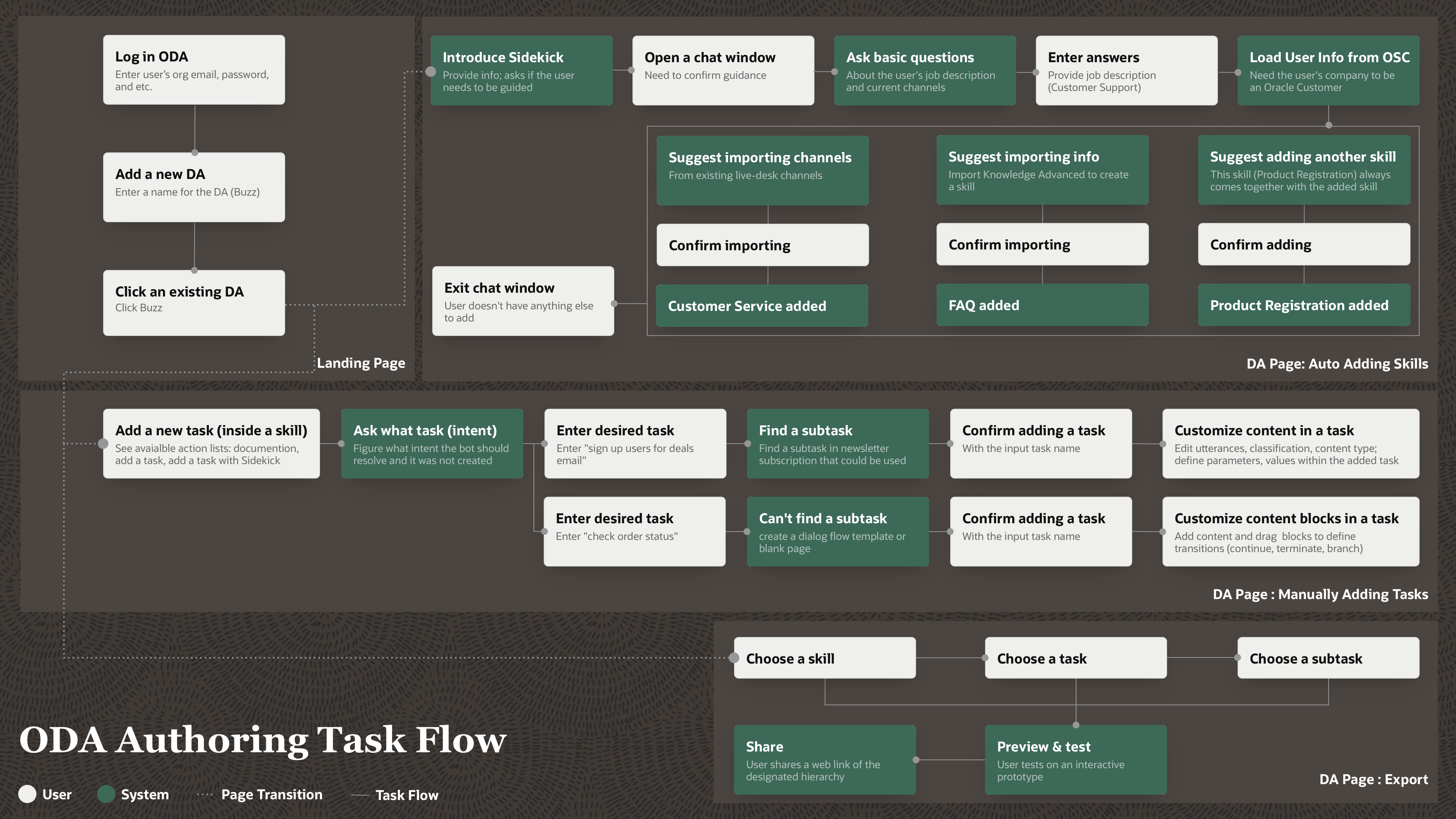
Task Flow
- Auto Adding Skills
- Manually Adding Tasks
- Export
Low-fi Design
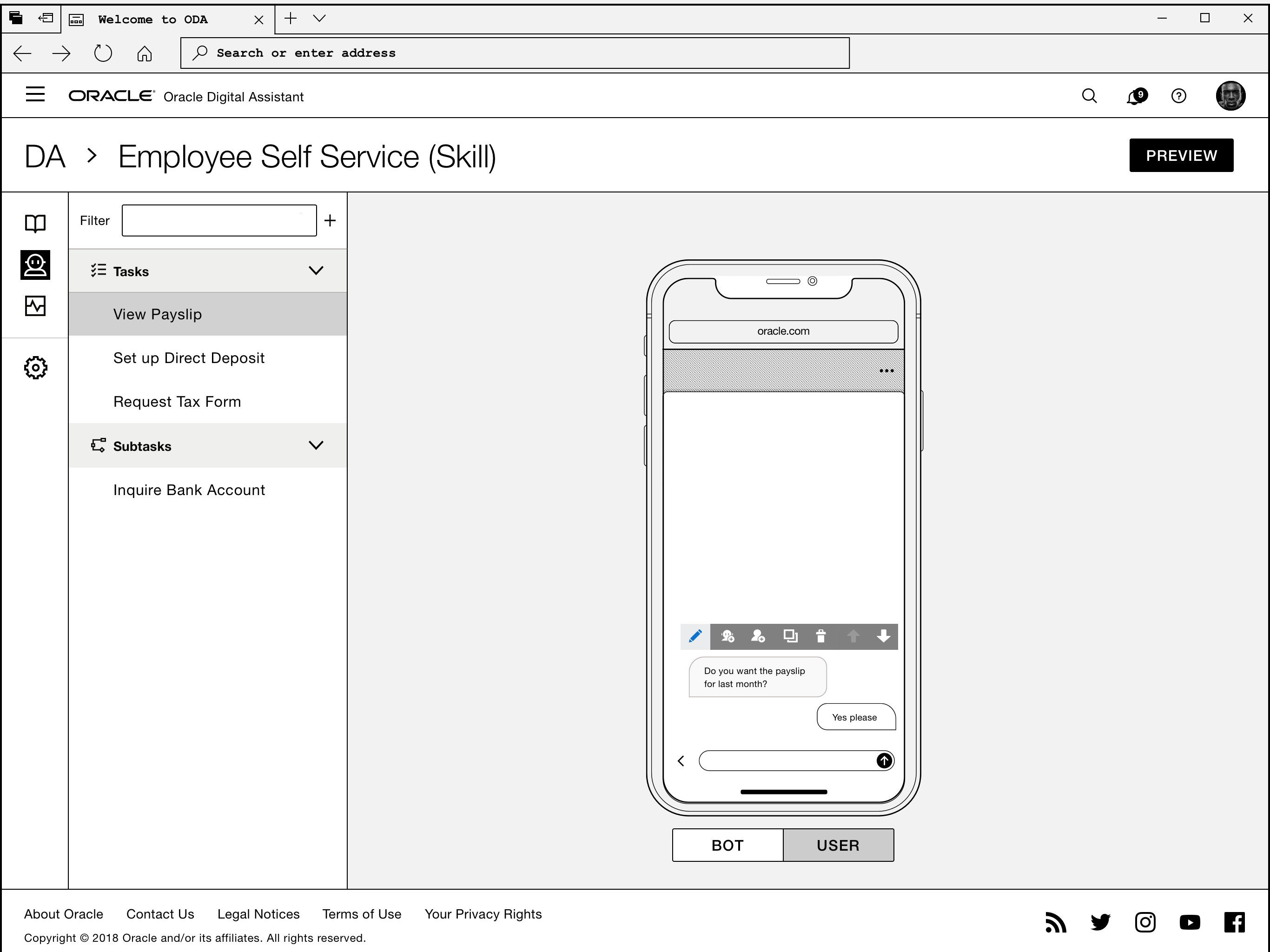
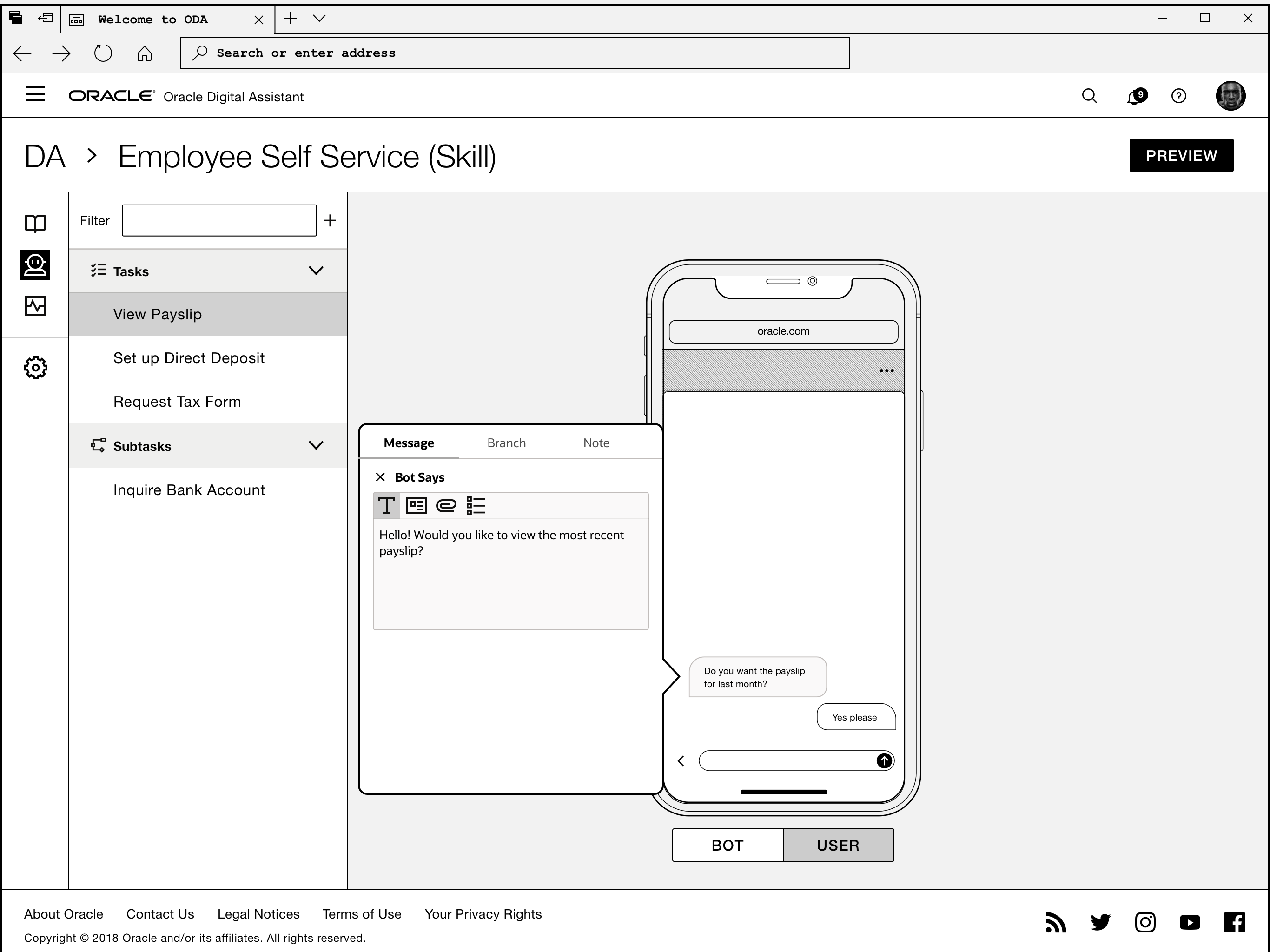
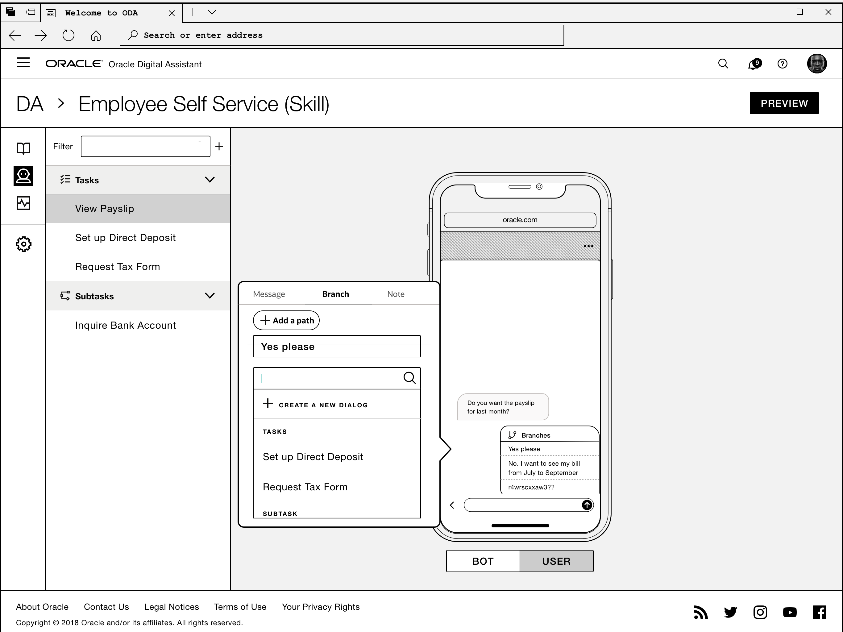
Simulate Messaging
1.
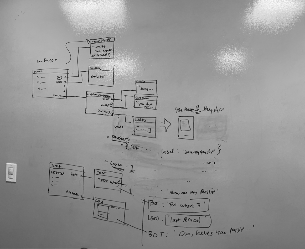
A functional skill has many nested branches depending on variables, parameters, and free marker expressions.
2.
The linearized messaging model may work better as a demo tool or 0-1 tool for users to kick off conversation design, yet it cannot handle more complexity as users progress.
3.
The users currently draw diagrams on a third party tools and then translate them in YAML in ODA later.
Auto and Manually Adding Skills
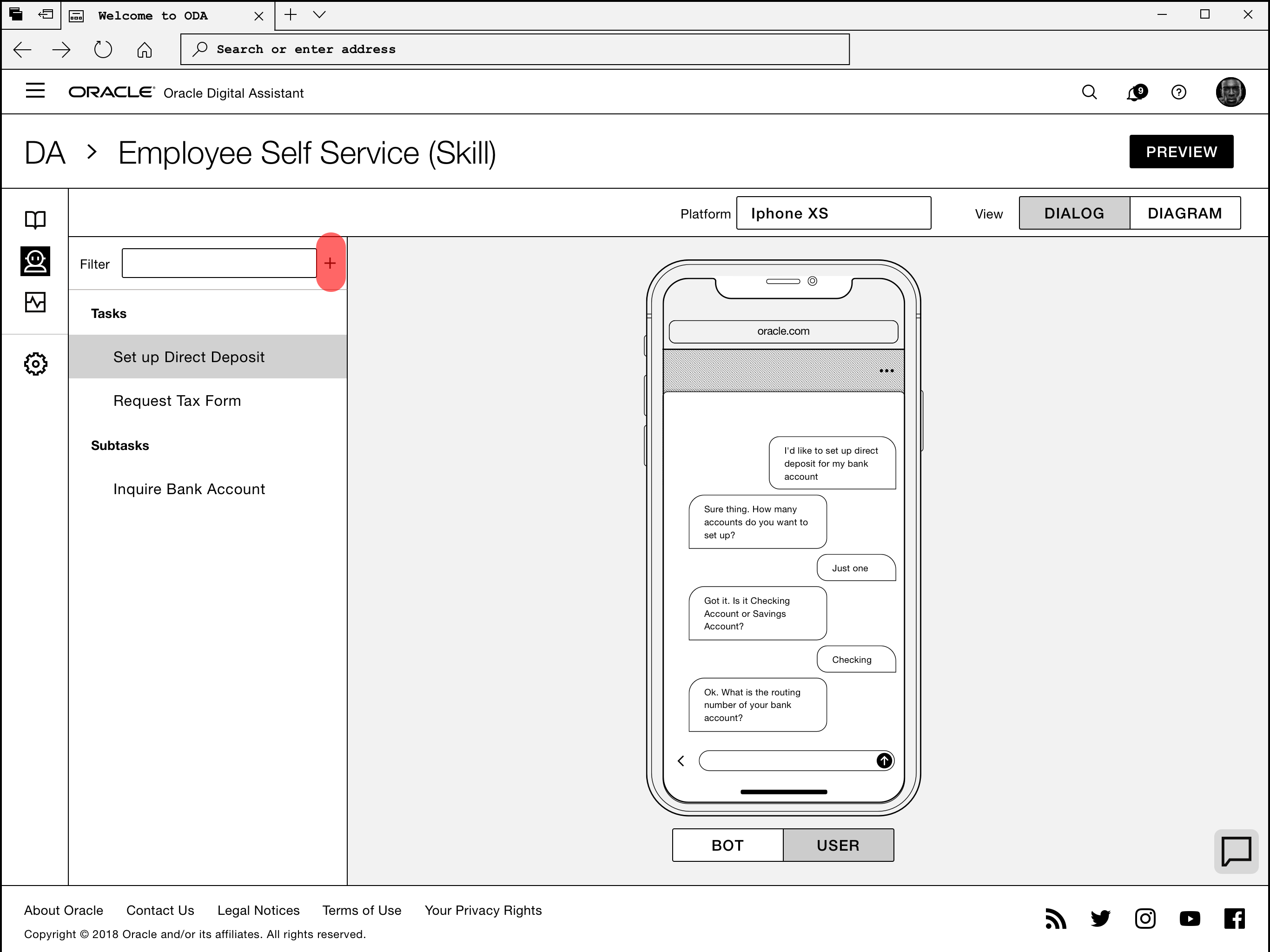
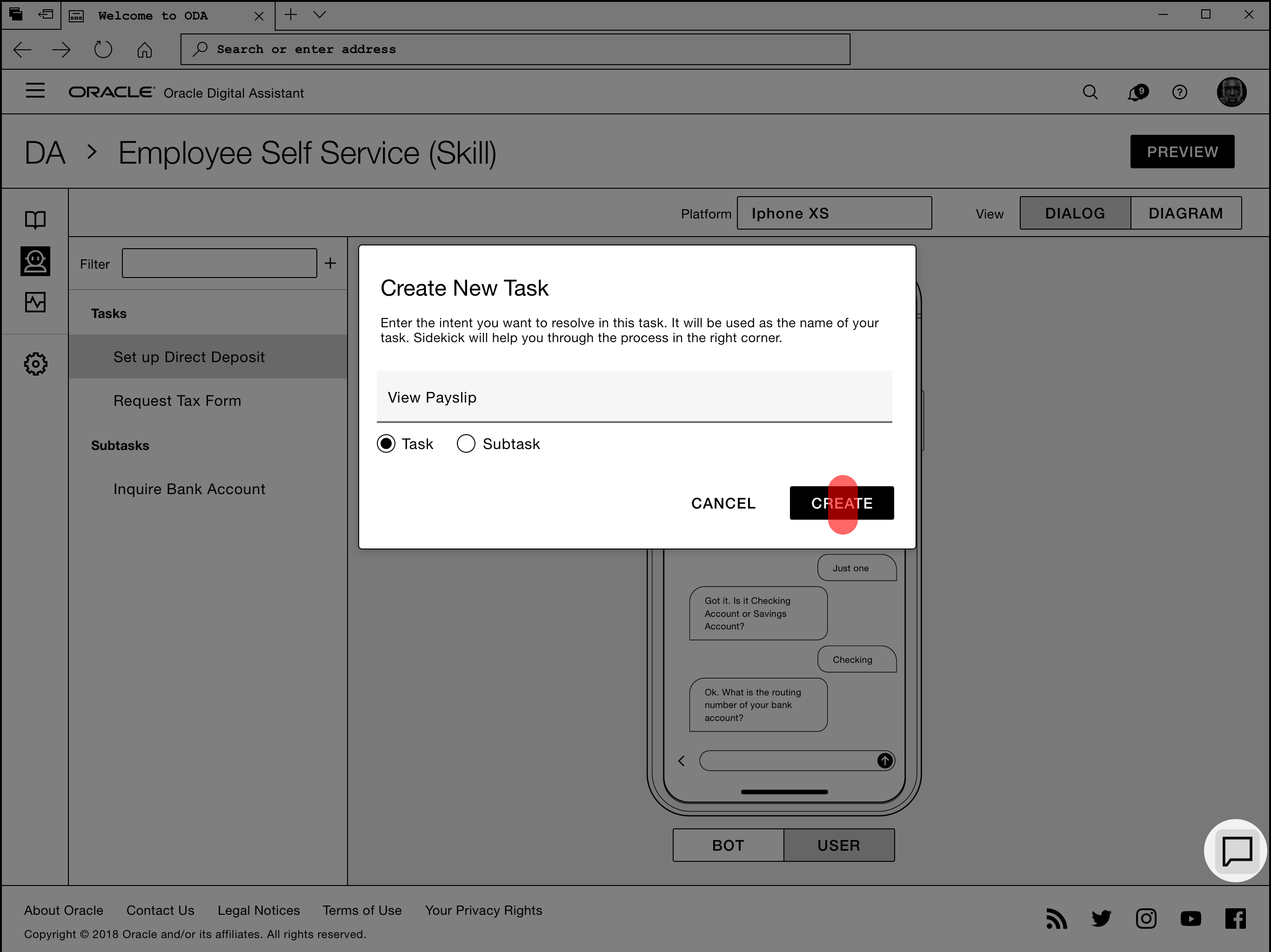
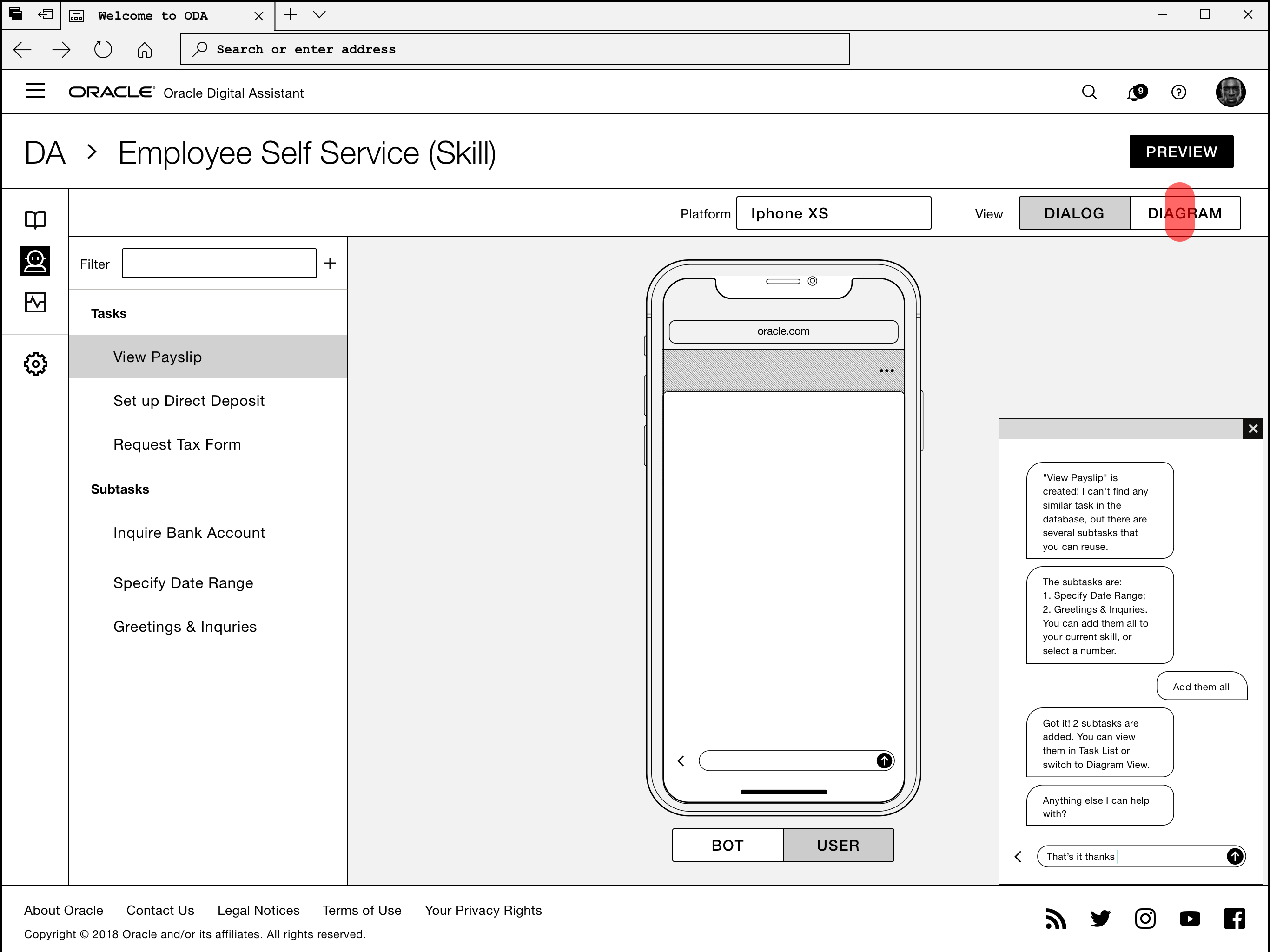
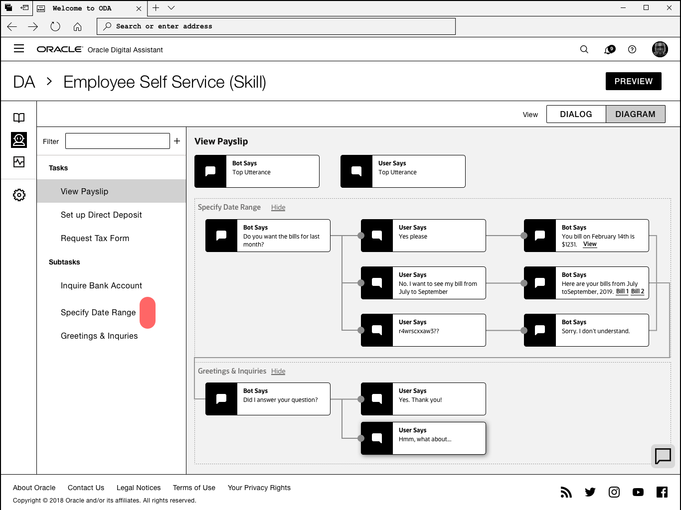
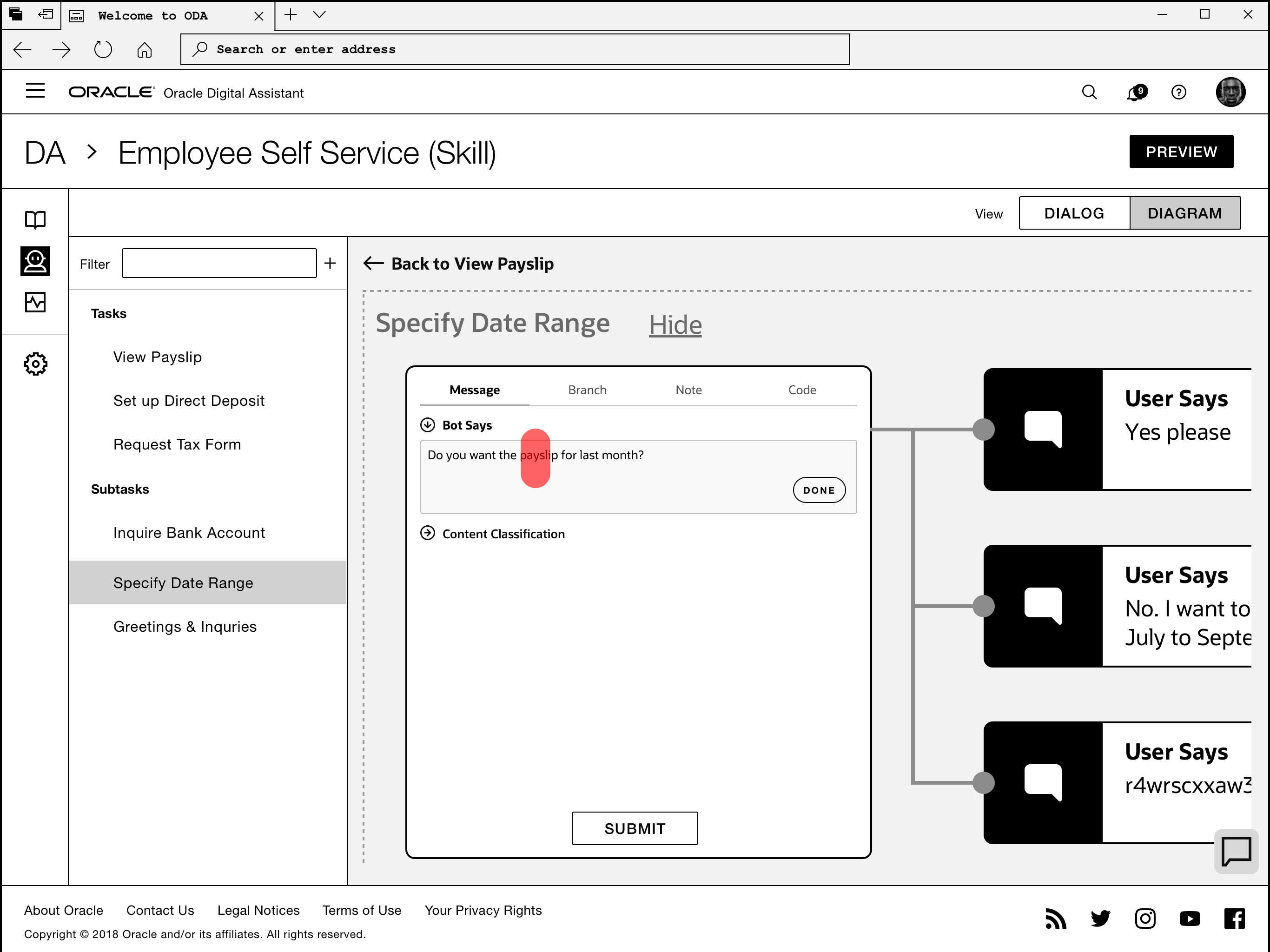
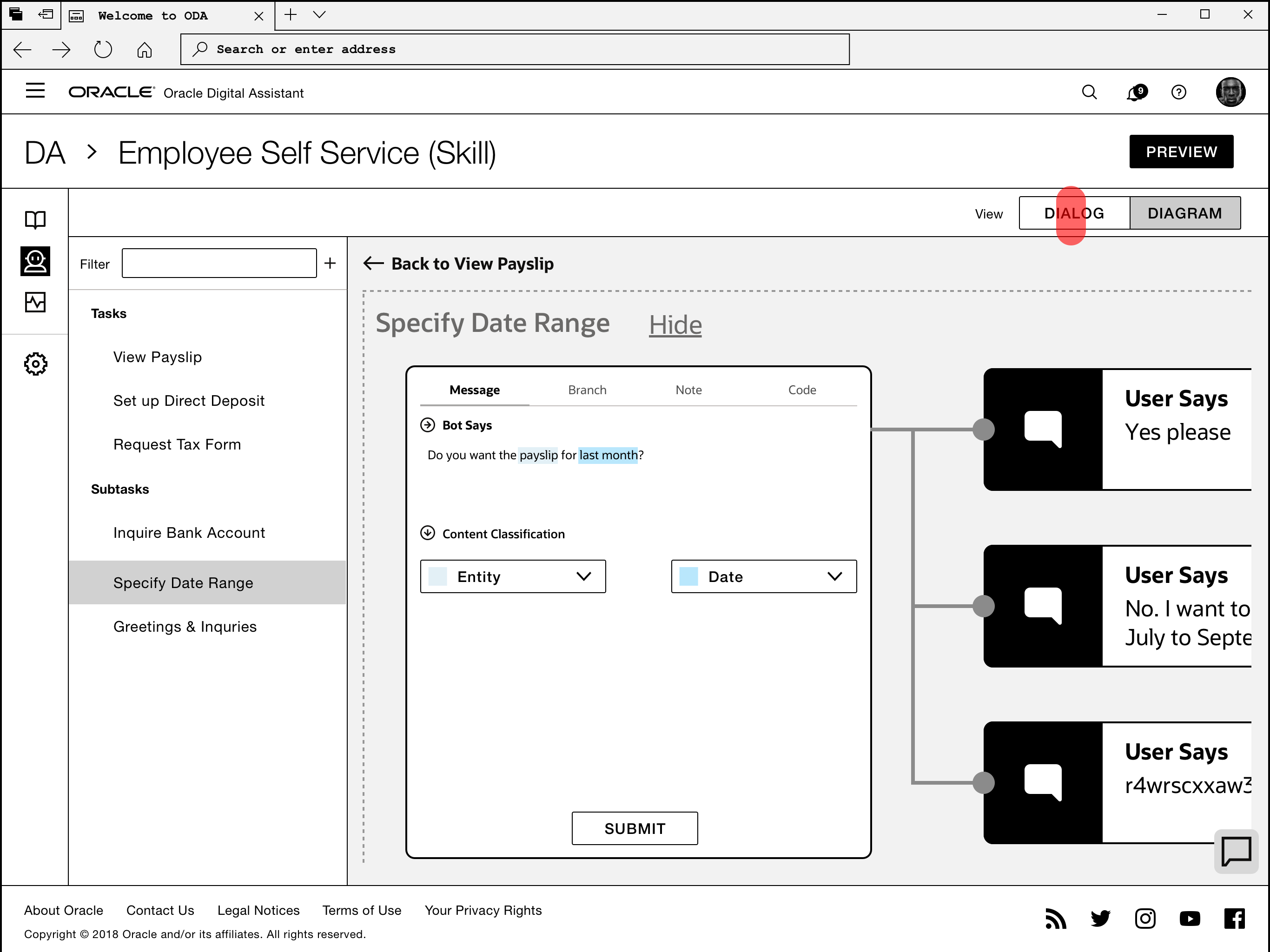
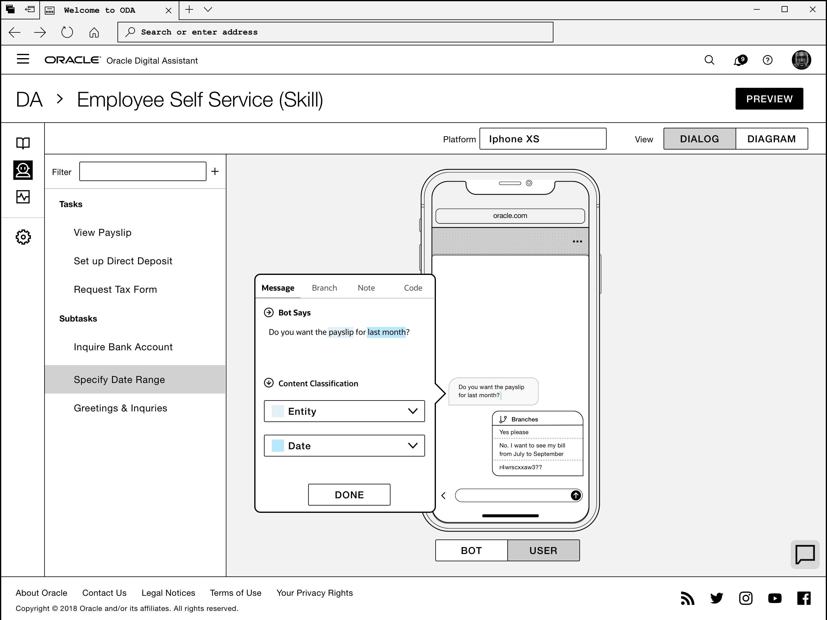
Diagram Node Inspector
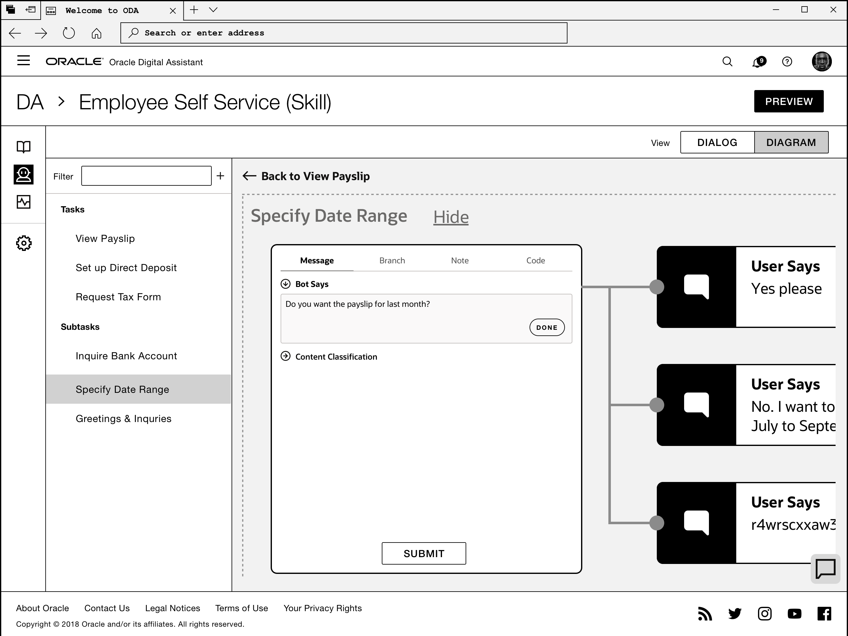
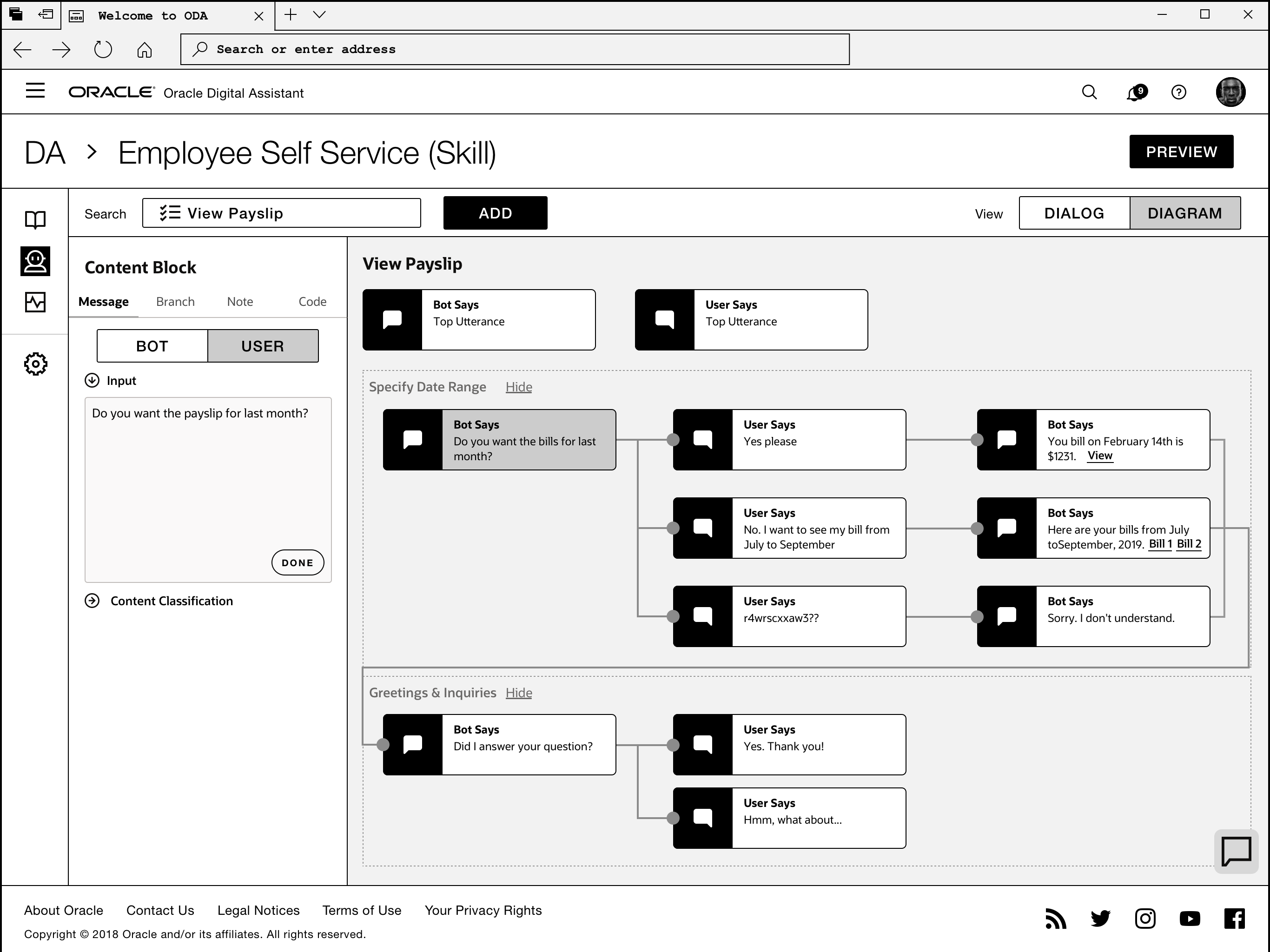
- The Zoom model's guides the user to the properties of conversation unit more naturally (with a zoom-in animation ), yet prevents the user seeing more context (more nodes) around the selected node.
- The Side Panel model doesn't create much visual transition, yet it shows more context without moving elements around and is easier to scale.
Midfi Design and Exploration
Node UI Model
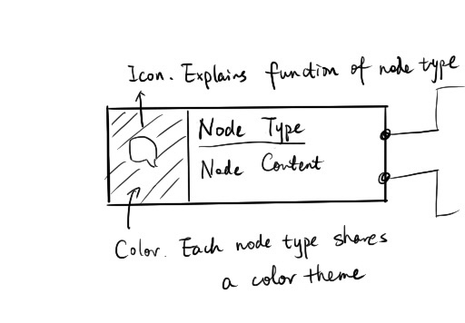
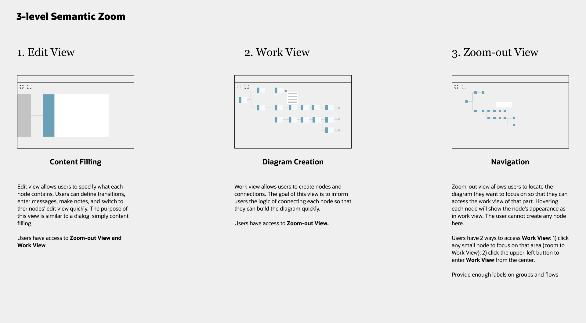
Diagram Interaction Model
Add new blocks and customize blocks
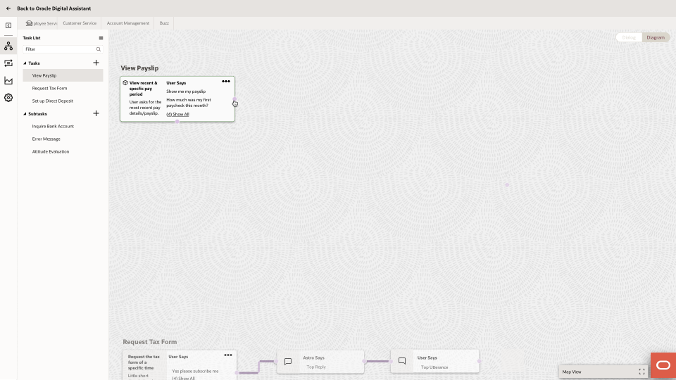
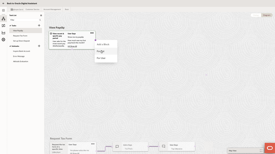
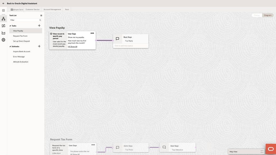
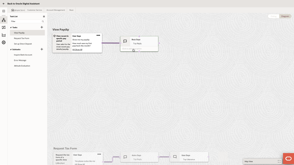
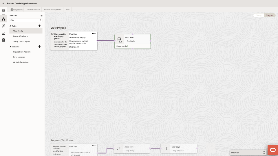
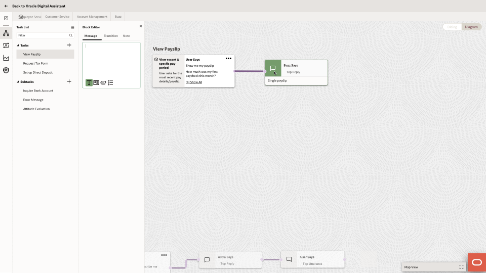
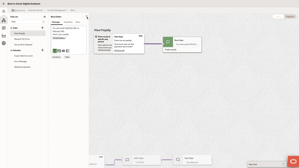
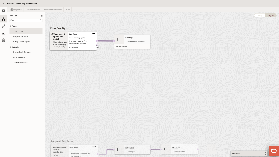
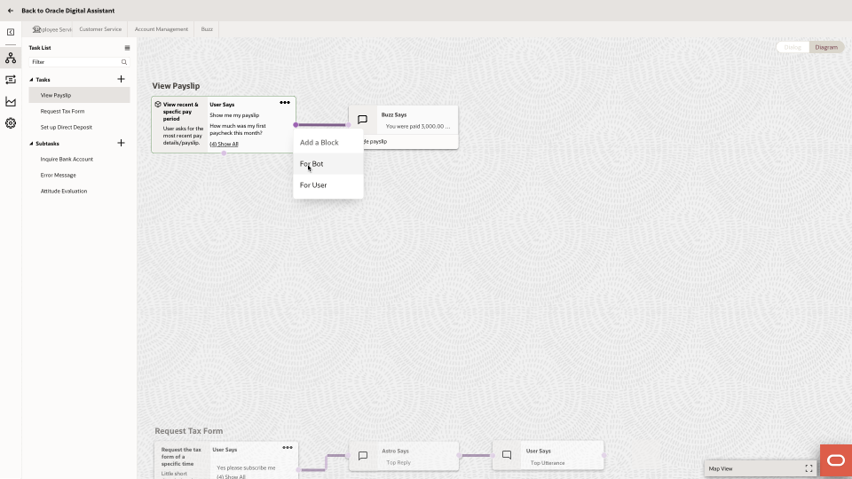
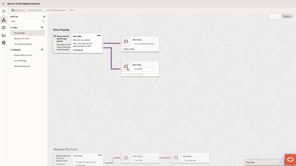
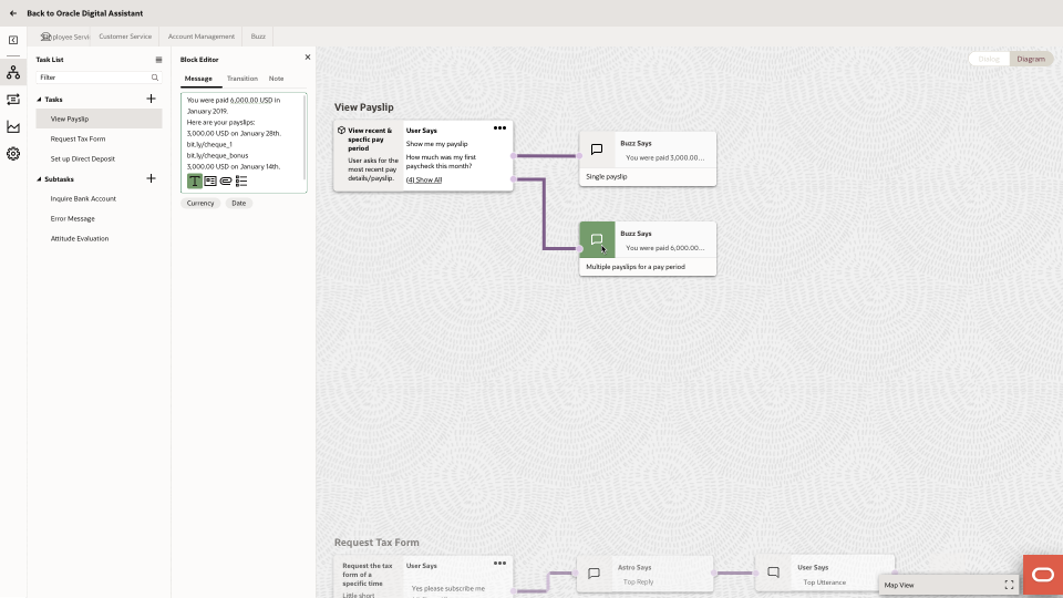
Drag reusable subtask and add nodes
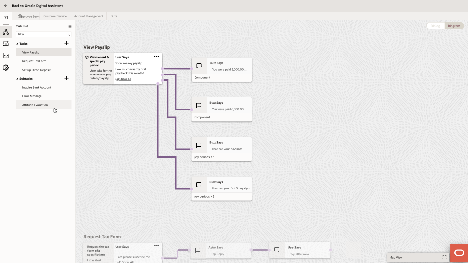
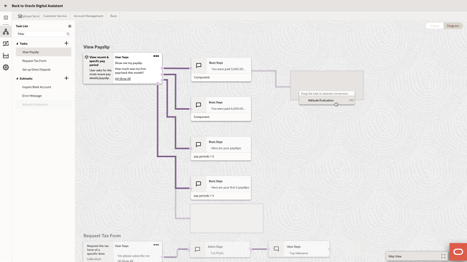
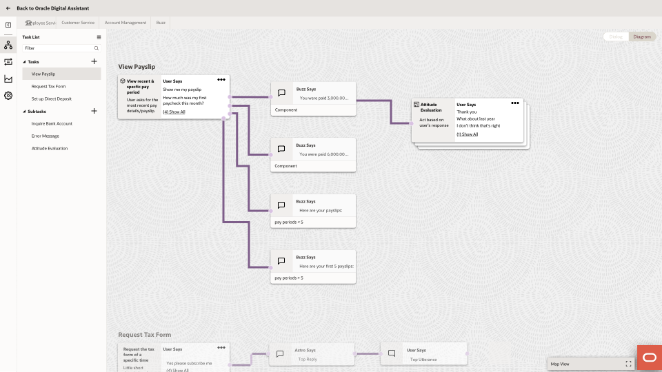
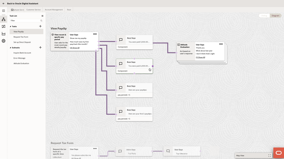
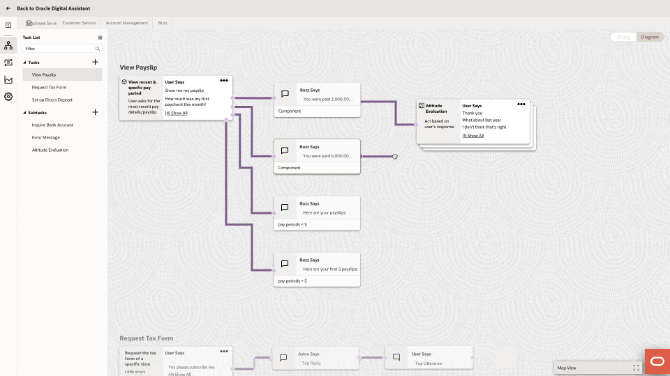
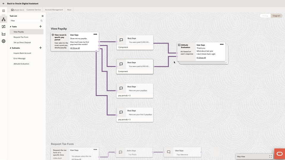
- Use Side Panel as the property inspector as it scales better with versatile needs (after we talked to the design system team).
- Allow the user to trigger another task in one task. We debated whether we need to differentiate subtask and task at all, since flattening the list with only one hierarchy is more intuitive.
Stakeholders Review
1.
The visual mode lowers the threshold of authoring chatbots for users. They could see business analysts using it.
2.
Currently, some of them have one giant Skill and other optional small Skills for things like greetings. Some of them have 3 to 6 rather balanced Skills.
3.
They wonder how they could transition to this with their YAML Skills. Can they use both YAML and visual diagraming?
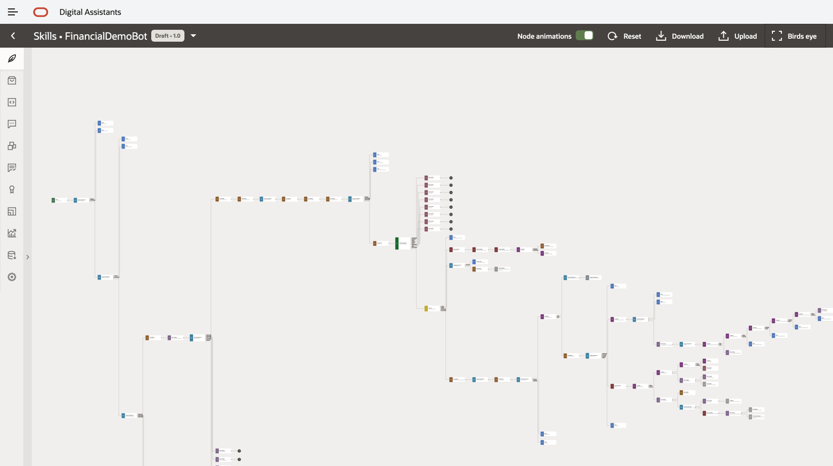
1.
Dialog view and Diagram view cannot coexist. The complex branches within the diagram cannot be translated to a linear flow as in Dialog mode.
2.
The Dialog view is more appropriate for a mockup tool, and can be used to kick off more complexed Skill.
3.
The rendering of a diagram is expensive if there are more than 50 states.
4.
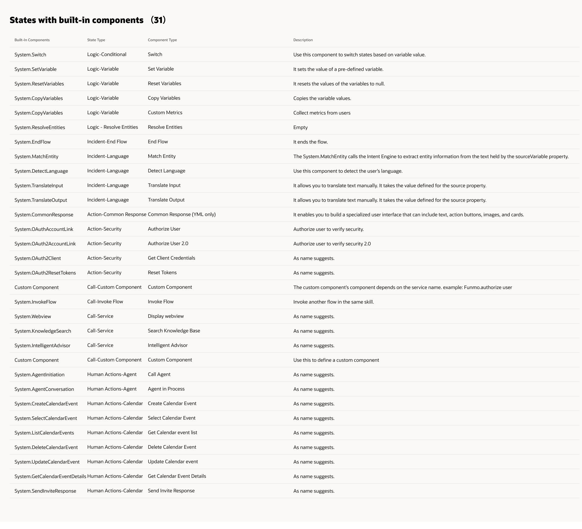
All of the system built-in components and events need to be supported.
MVP Scoping & IA
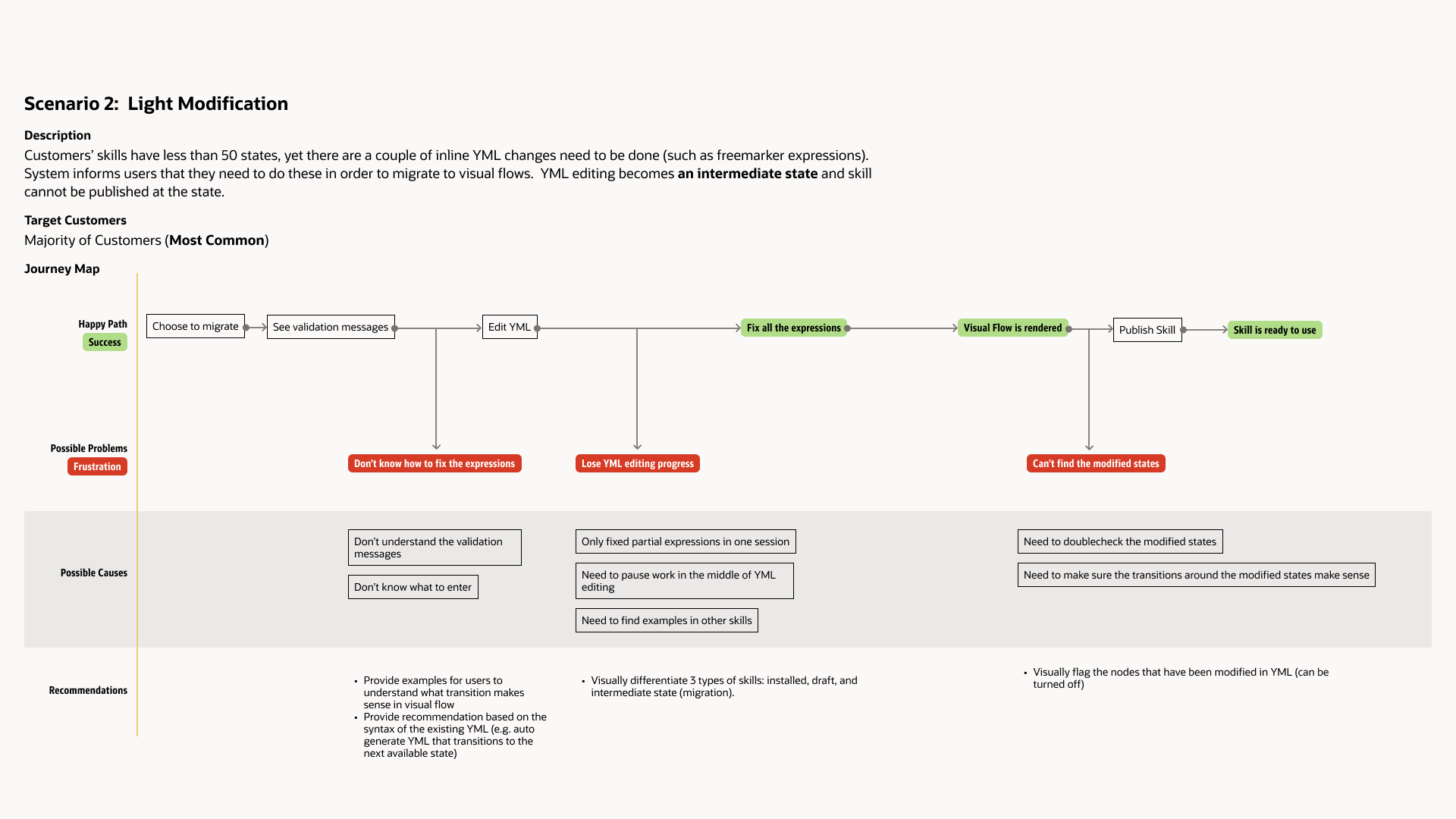
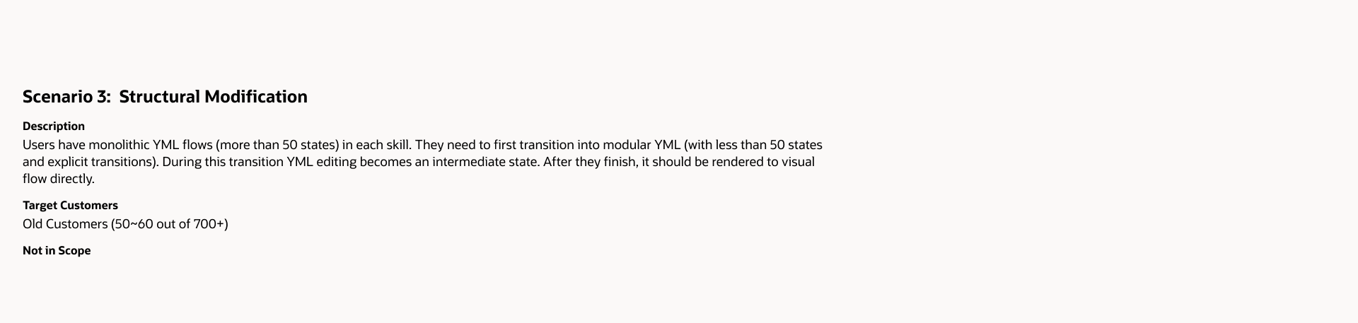
Migration User Journey
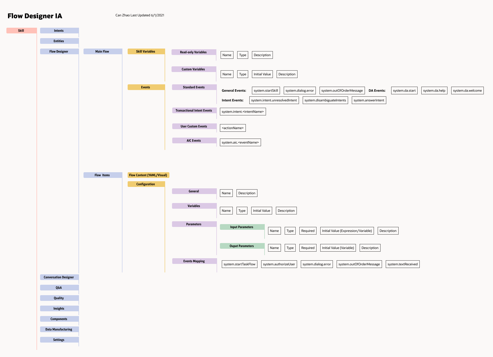
Flow Designer IA
Component Picker IA
1.
The velvet-labeled levels add extra layer/complexity for the user to select the desired components.
2.
The velvet-labeled levels are more helpful in the YAML context than the diagram context. For example, Under "Use channel-specific features," they all use the same component System.CommonResponse.
3.
While in the YAML world some of these scenarios provide template YAML code, in the diagraming world we could use UI controls to achieve the same goals.
4.
This component picker is a mix of "pick by template" and "pick by component type." We should these two adding experience.
The stakeholders agreed, yet consider the component pickers still valid to some customers and might be worth exploring after MVP. I proposed doing some user research and phase out the changes.
Node/State Types
Diagram components are mainly used to manage diagram and transitioning. Virtual components are simplified versions of existing components.
1.
Currently, many of our users use System.CommonResponse for almost every message. This component has many property fields that power users can utilize for complexed needs, yet it might be too confusing for common users that haven't read our documentations carefully.
2.
A lot of our built-in-components were created in the YAML context, but might no longer meet the user goals in the diagram context. We need to revisit them with more use cases.
State Information Architecture
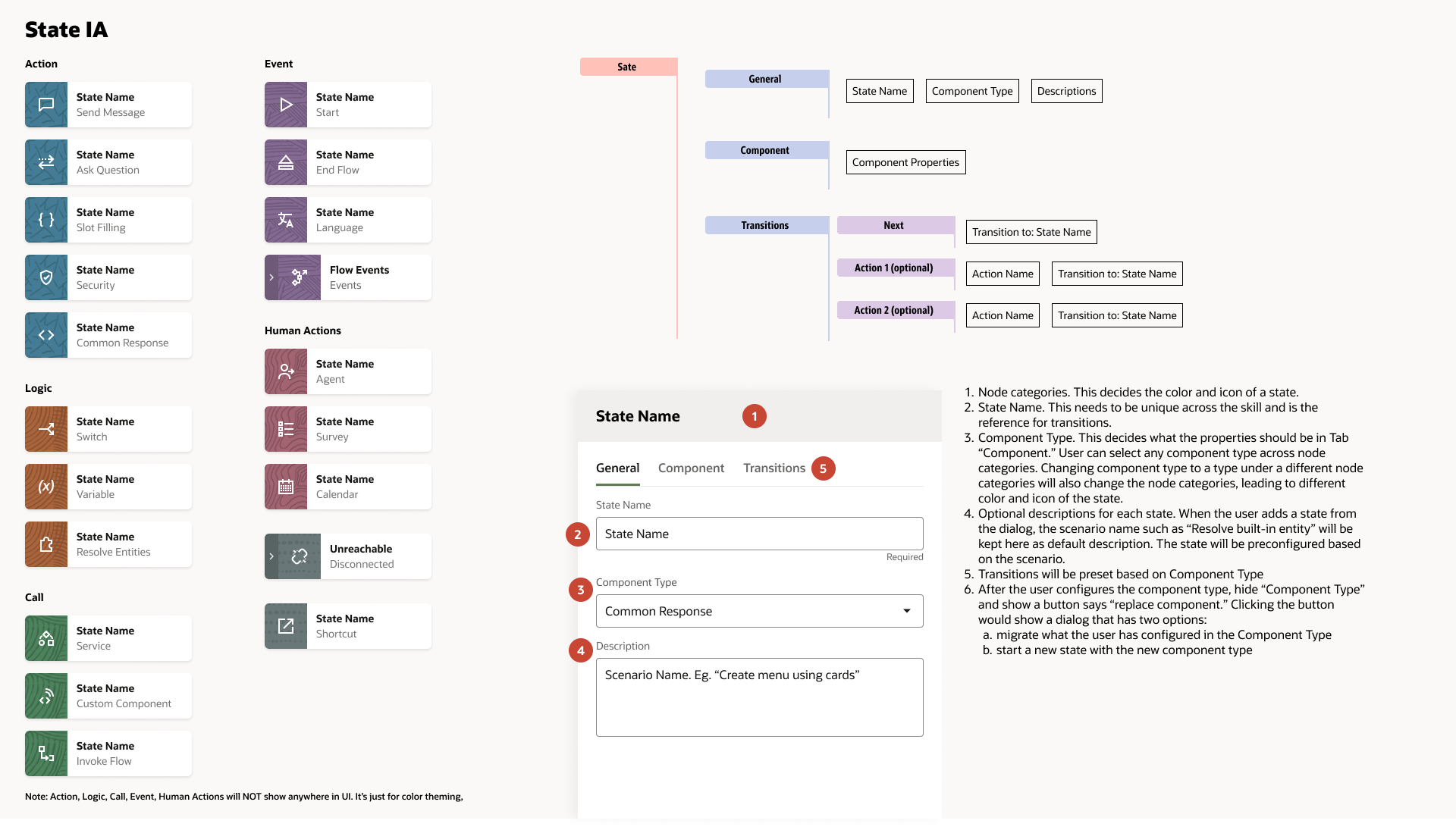
A lot of our built-in-components have many fields to fill and it will be a long scroll to reach the end. We are also not sure how many transitions the users are going to create now. We should keep them separated for now as it scales better.
Hi-fi Design Process
UI Template
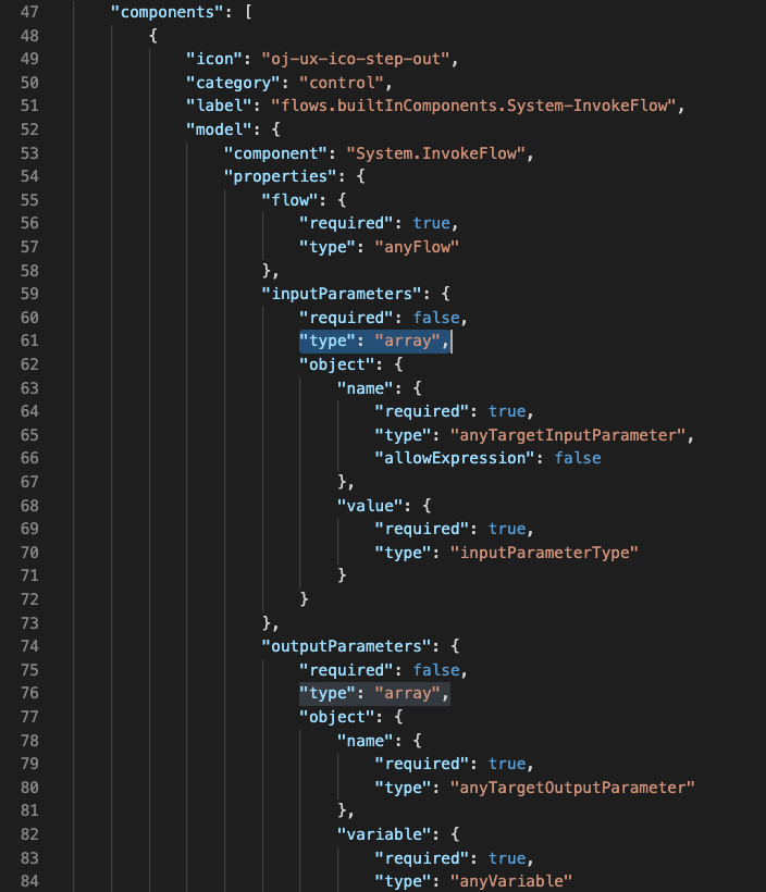
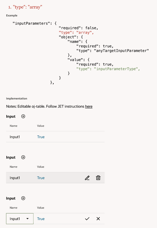
This is how it works: the engineers give me a JSON file listing all of the properties and their types in each built-in component, and I summarize repeatable UI patterns that can be reused in these components.
For example, in component "System-Invokeflow," it has a property "inputParameter," and its UI type is "array."
Users Feedback
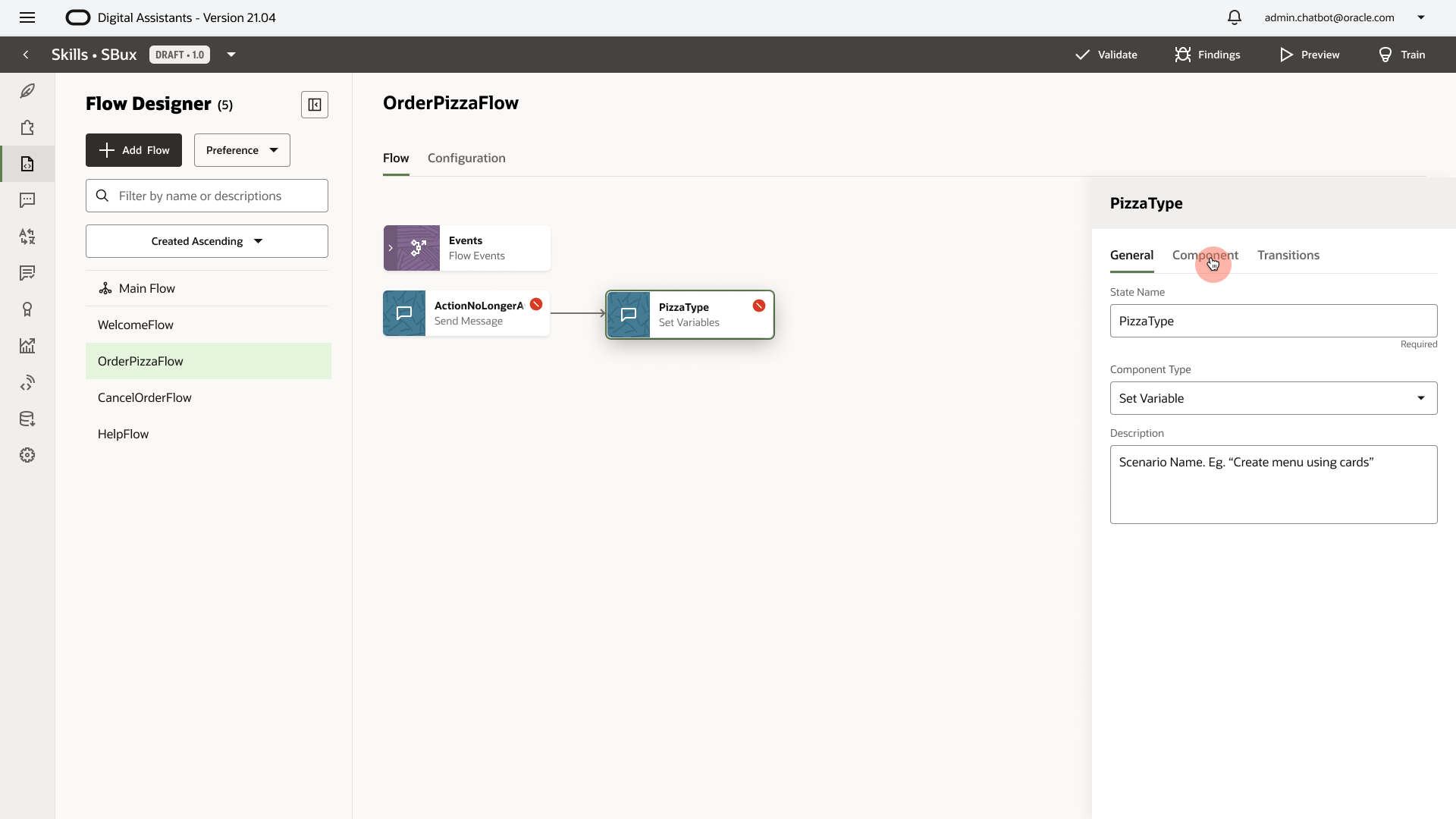
1. Extra Click
After creating a new state, the user needs an extra click on "Component" to edit the actual content for non-virtual components.
We should make the "Component" selected by default when a state is created.
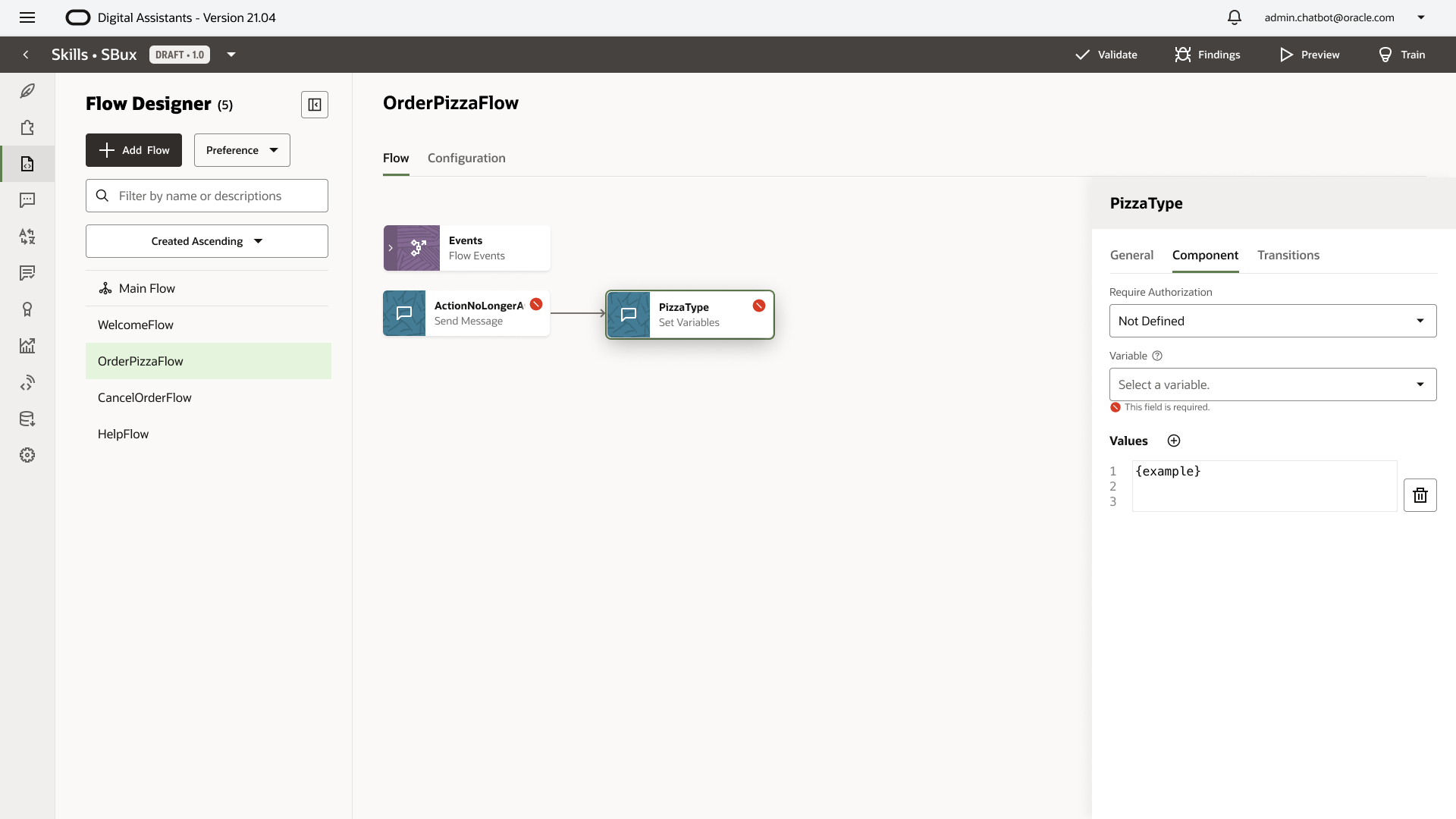
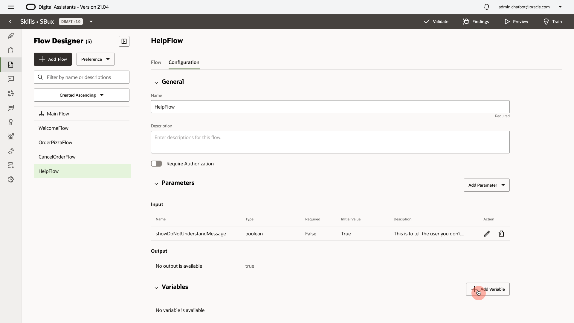
2. Separated
The variable configuration is separated from the flow design experience. If a user wants to select a variable for a state, and the desired variable doesn't exist yet, the user needs leave the page and go to "Configuration."
We should allow the user to create on-demand variables inside the flow experience.
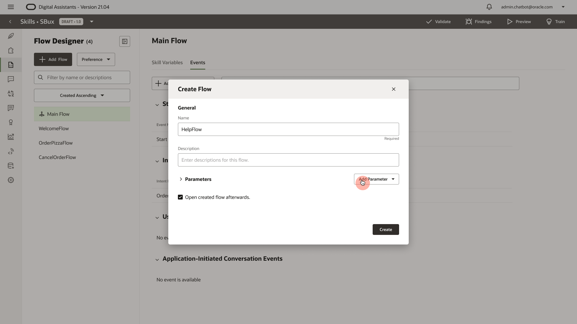
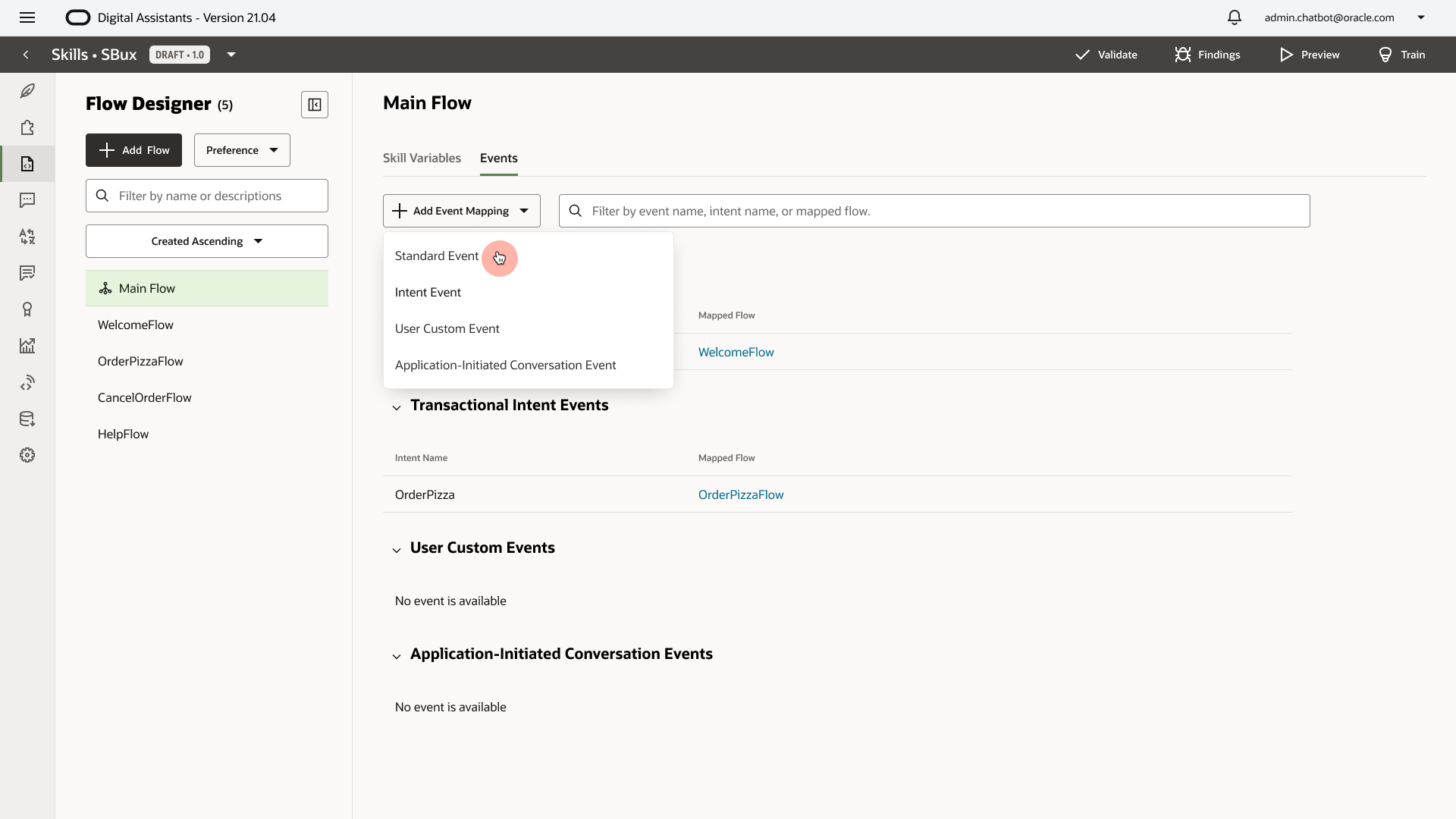
3. Map Intent
Intent Mapping is hidden in "Main Flow - Events - Intent Events." Mapping an intent to a flow is a very common behavior when a user creates a flow.
We should allow the user to select an intent when they create a flow.
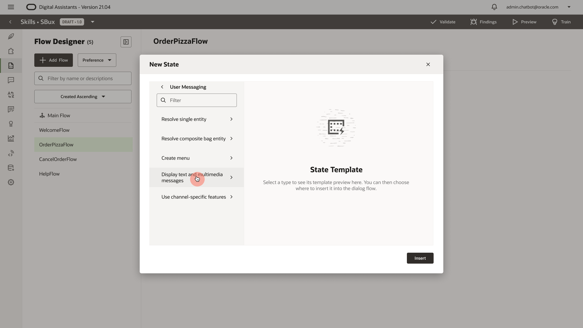
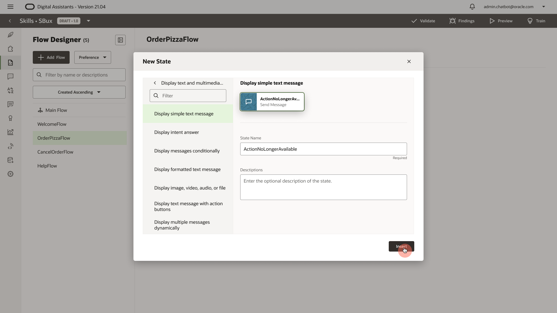
4. Hidden
1. The simplified virtual components are too hidden within the component pickers. The user needs to click the navigation back and forth to find the desired component.
2. The context of where the user is adding the state is also hidden behind the component picker dialog.
For MVP, at least we should surface the 3 virtual components to the top level.
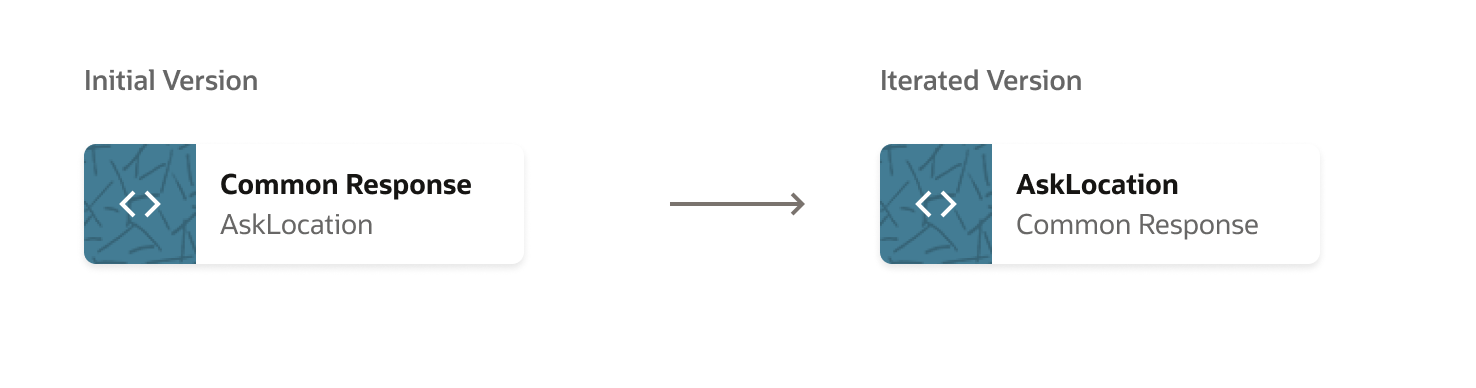
5. Primary and Secondary Text
Reflections
The whole process is like a marathon with many ups and downs. Some lessons I learned:
- Be strategic. I documented and shared a variety of design solutions with stakeholders, helping them making decisions, yet I'm not part of the planning process when some decisions are made by PMs.
- Involve engineers early. We spent too much time on the blue-sky design instead of investigating what the legacy backend supports, dreaming that they would let go some of the legacies and build new ones. We should involve them early and see what's feasible within the timeline, and create a long-term and short term goals to kick-off design.
- We definitely need more user research data. Currently, most of the users sessions are more like demo/walkthrough instead of structured usability testing. I've only talked to 3 out of 700+ customers. We need to recruit users based on user types, and use user data to inform design decisions. Fortunately, PMs heard me and will release a LA (Limited Availability) release before MVP. I made a user research proposal: