← All workSchema Design / Financial research

Morningstar Direct Cloud

Provide UX strategies to redesign financial research tools
Project Overview
At Schema Design, I was assigned to work with Morningstar, Inc., a global investment research and investment management firm headquartered in Chicago. As a design firm, our mission was to provide UX strategies at a wireframe fidelity so that our clients could make incremental changes in the right direction. With 1 graphic designer and 1 creative director at Schema, I worked with Morningstar's in-house designers (through travels and remotely).
‍Morningstar Direct/Office Cloud is a web-based portfolio and investment analysis management software for financial professionals. The software was transformed from a native application to a web application that brings many new challenges.
My Contributions
I worked with one graphic designer, one creative director in this project. My contribution includes:
  • Interaction design
  • UX Research
  • Information Architecture
Timeline
2018.10 - 2018.12
TOOLS
Sketch, Ominigraffle, InVision, Flinto
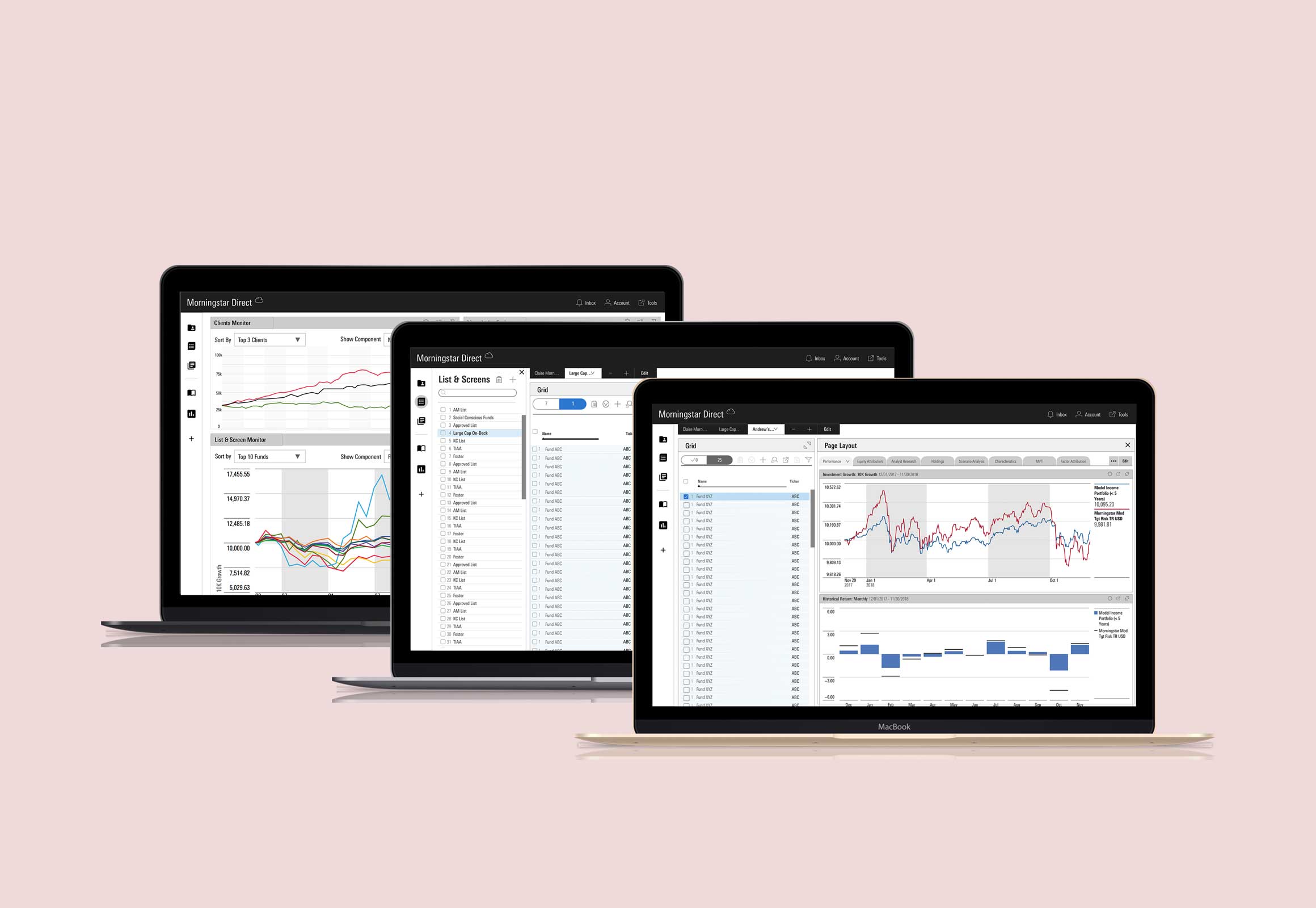
Morningstar cover
Design Challenge
How can we improve the navigational experience of Morningstar Direct Cloud with least learning curve for new users and previous users?

According to our clients, Cloud does not have an intuitive and predictable IA pattern that orients their users to (a) where they are, (b) what they can do, and (c) how they can accomplish their jobs with confidence. Morningstar also does not want to change their naming system considering the learning curve of their previous users.

Understanding The Users

Target User Types
In a word, Morningstar Cloud has 4 types of target users and each of them have slightly different workflows when using the product.
  • Asset Managers
  • Wealth Management (Home Office Researchers)
  • Wealth Management (Client-facing Advisors)
  • Independent Advisors
Activity 1
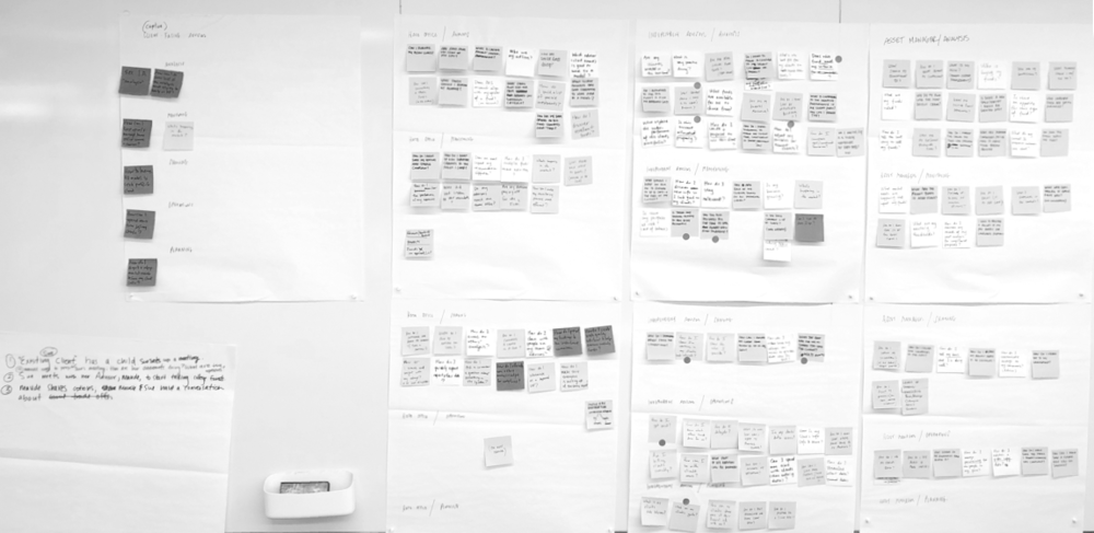
We asked stakeholders that represent different types of users to ask “how can I“ questions when using the products, and group them according to themes of “Planning, Analysis, Monitoring, Sharing, Operations.“
Activity 1
Activity 2
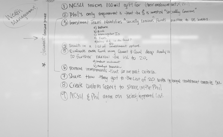
We had focus group sessions with stakeholders and asked them to describe a typical workflow for each of the user type. Below is an example of Wealth Management (Home Office Researchers).
Activity 2
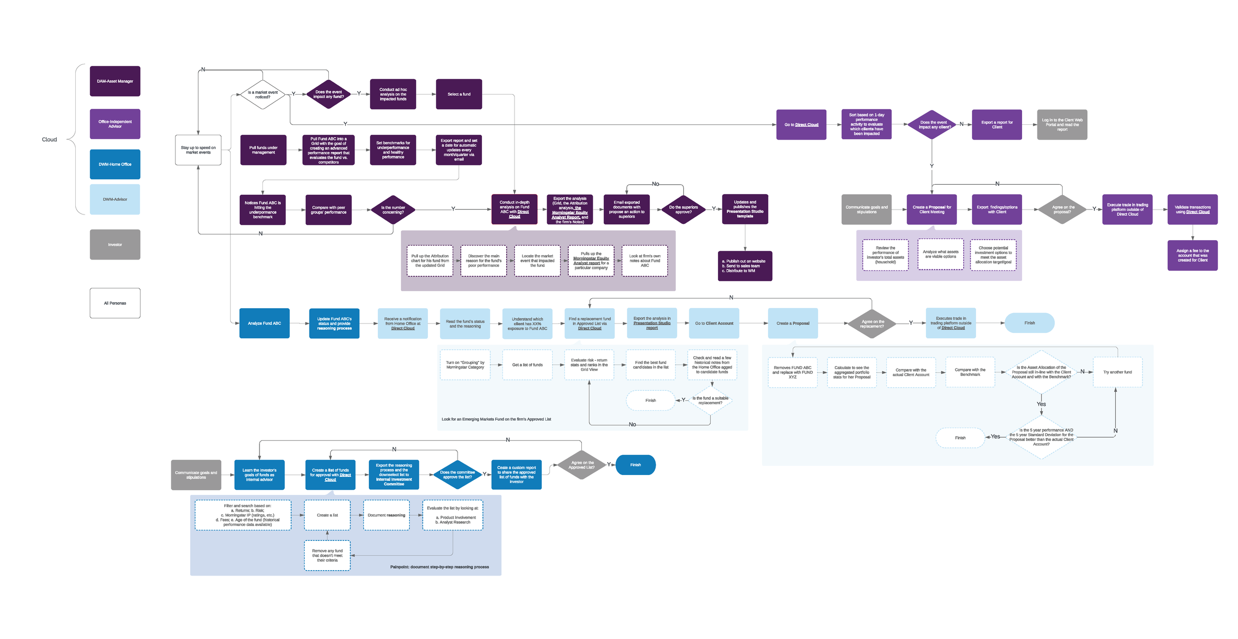
Based on the input from Activity 1 and Activity 2, I mapped the current user flow for 4 user types.
userflow 20181026 v2 cz
Main Insights
1.
When market events happen, Asset Managers, Home Office Researchers, and Independent Advisors need to take ad hoc actions.
2.
Asset Managers, Home Office Researchers and Independent Advisors should stay tuned and find appropriate funds purchased from Asset Managers.
3.
A collaborative relationship occurs between the Client-facing Advisors and the Home Office Researchers in Wealth Management Firms.
4.
Independent Advisors' workflows overlap with Client-facing Advisors, with additional workflows such as billing.
5
For Independent Advisors and Client-facing Advisors, their actions are driven by the performance of client accounts.

Understanding Morningstar Direct Cloud

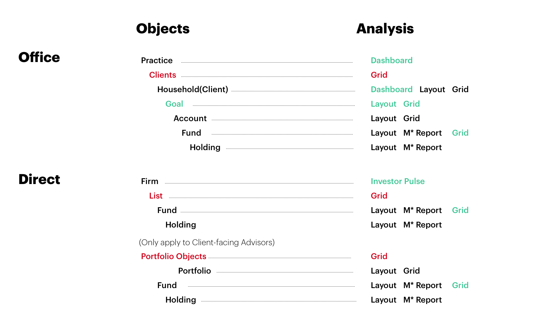
I led meetings with Morningstar’s product managers, and diagrammed their current object relations. After that our team helped designers at Morningstar regroup the object types, and clarified definitions of each object type.
Object Relations
Red-colored objects are groups of primary objects that are targets of object management. Green-colored objects are currently not in the system yet in Morningstar’s future strategies.
Object Relations
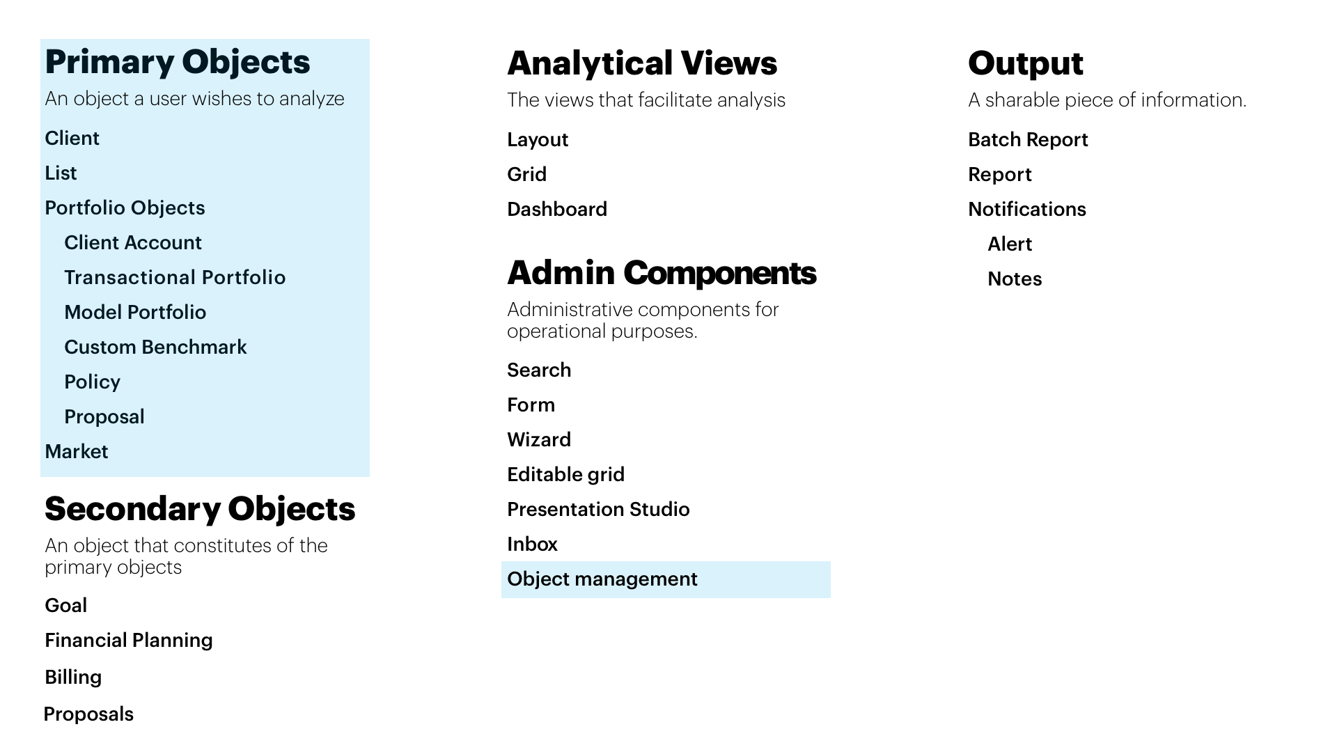
Object Types
Blue-shaded areas are the scope we agreed to work on considering the limited budget.
Object Types
Takeaways
1.
Asset Managers, Home Office Researchers, Client Facing Advisors use Direct Cloud, while Independent Advisors use Office Cloud that includes billing and goals.
2.
While in Office Cloud, objects are all grouped under "Clients," in Direct Cloud, client accounts are grouped under "Portfolio Objects" that include a variety of objects.
3.
Portfolio Objects vary according to different user types.
4.
The navigation and management of the primary objects are of the top priority, while the location of the secondary objects should be considered in this project.

Usability Research

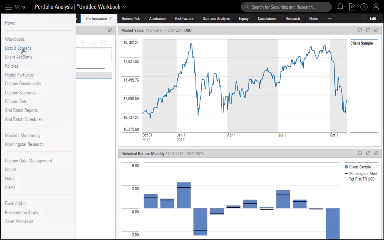
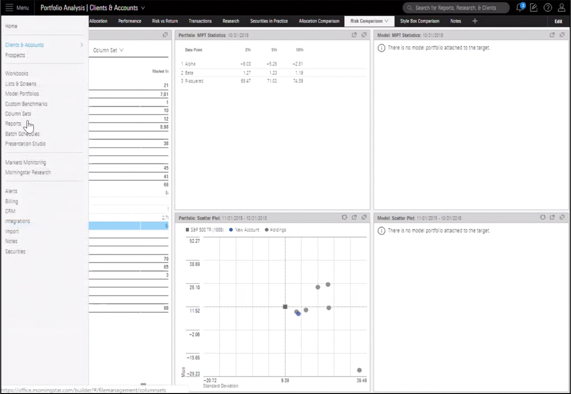
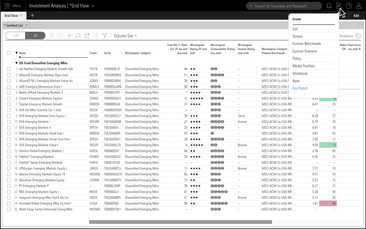
I asked the stakeholders that represent different user types to accomplish the typical user flows we mapped together and video-recorded the process. I listened to the stakeholders’ feedback and conducted a heuristic evaluation of Morningstar Cloud based on users interactions in the videos.In the realm of navigation and object management, 3 major problems occur in the current product:  
Disconnected Actions and Modules
The connections between available actions and modules are disorganized.

"Grid View" is not informing what the user's current targeting object is.
P1
Transitioning Burden
The user has to command click and open a new tab on the browser in order to transition from Portfolio Analysis to Investment Analysis.

image asset
Extra Steps to Manage Objects
After generating a report, the user has to go find it by opening the menu and leaving their current workspace to head to the Reports page. The user has to repeat several steps in order to go back to the original analysis page.

p3 1
View complete usability research

Low-fi Design

Ideations
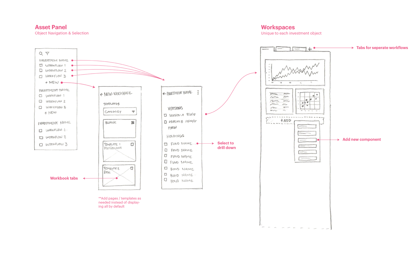
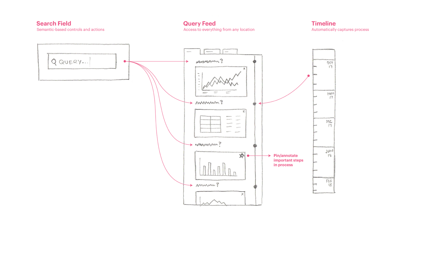
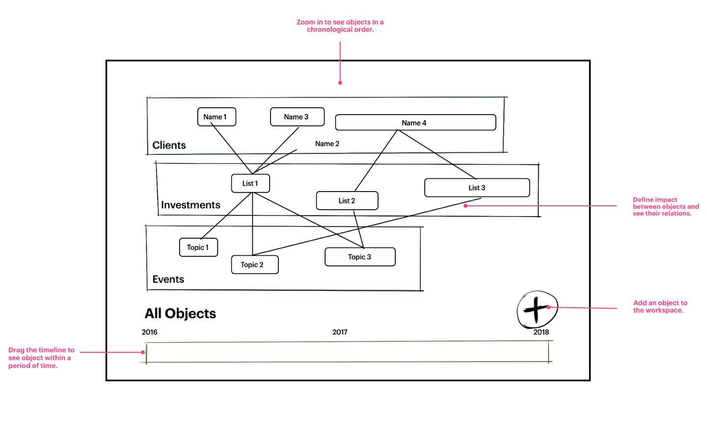
After Activity 1 and Activity 2, we understood the users better and ideated some concepts as potential solutions:
Page Builder
Page Builder
Notebook
Notebook
Zoom
Zoom
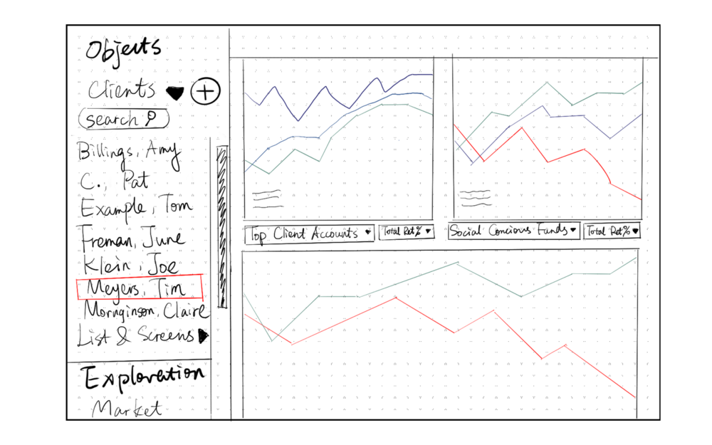
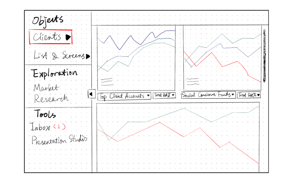
However, after reviewing the concepts, our clients commented that though creative, “none of the concepts are implementable” on their current system. That was when we went back to conduct usability research in order to understand the product better. After the usability research, I sketched a low-fi prototype considering one common scenarios:

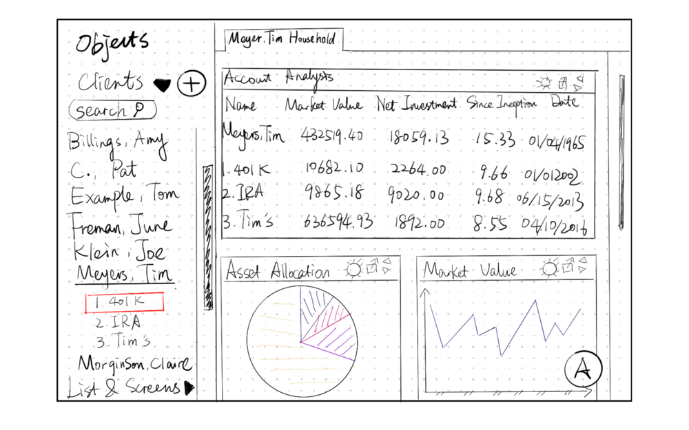
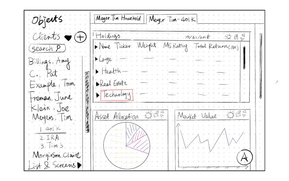
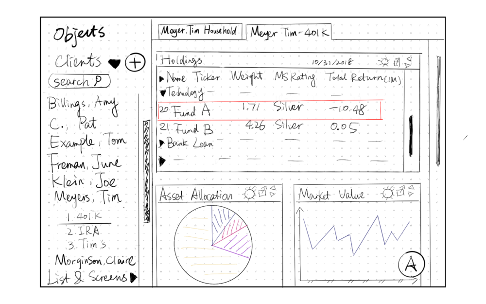
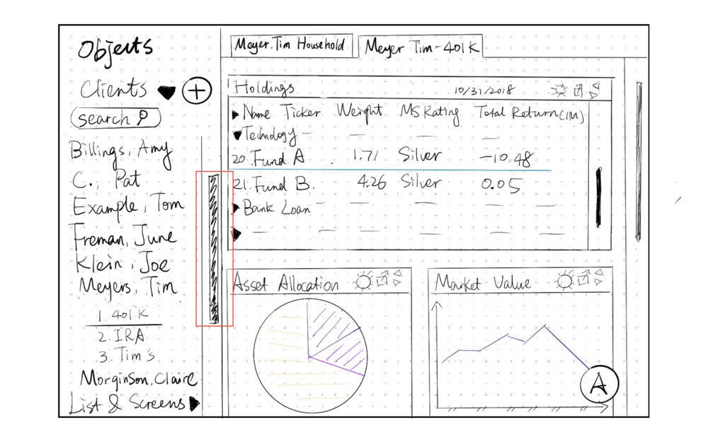
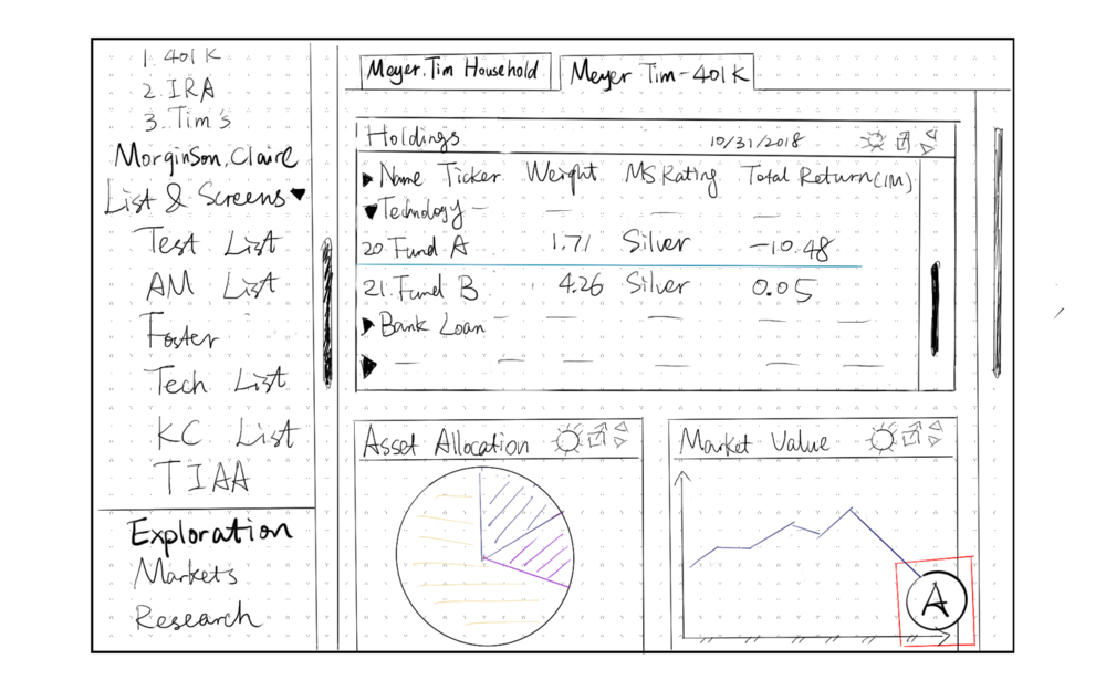
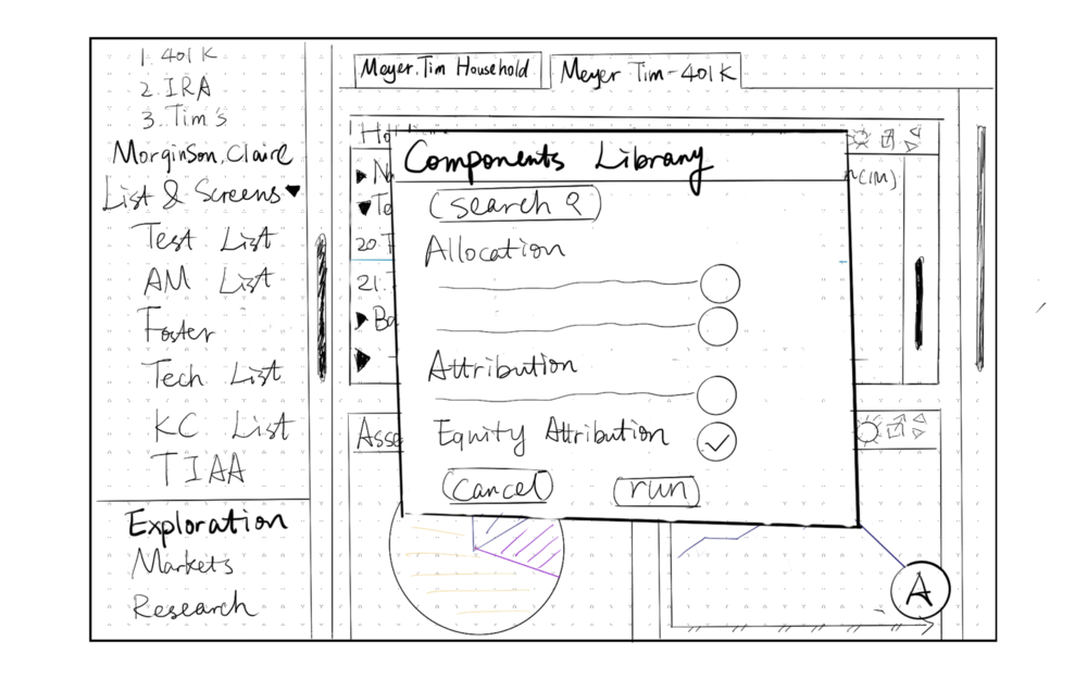
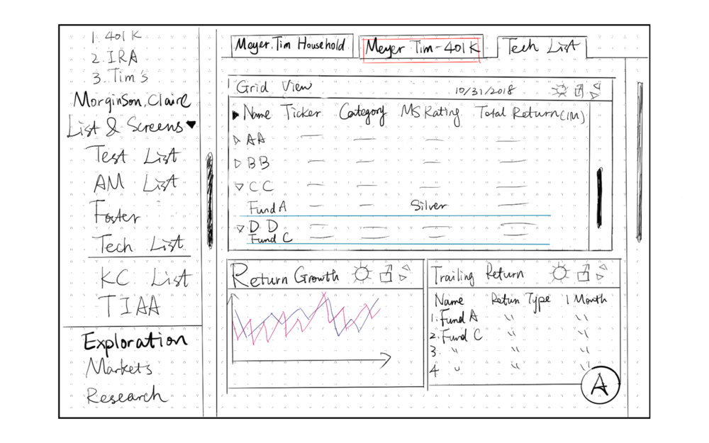
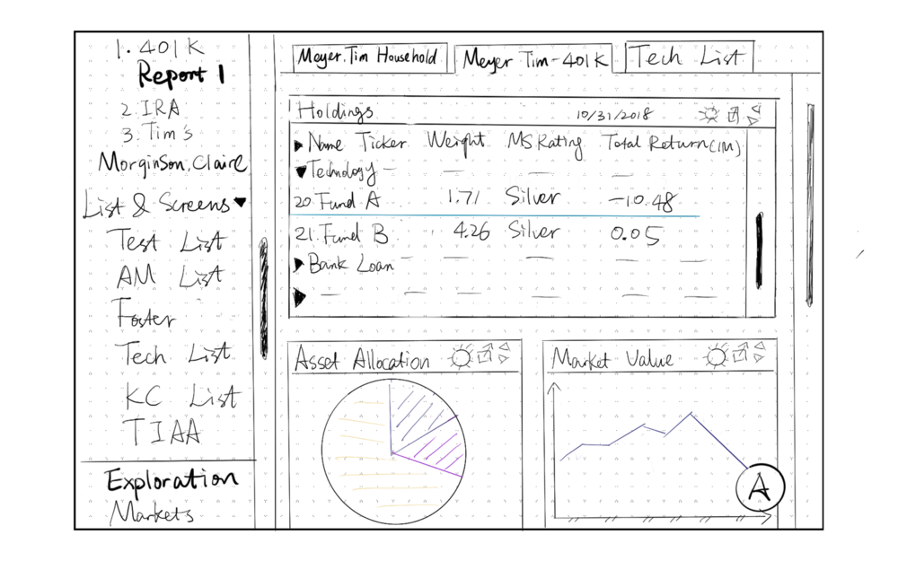
An Independent Advisor/Client-facing Advisor receives a call from a client, Tim Meyers, and the client wants to know how he’s impacted by recent news regarding a security breach at Facebook.
lowfi1
lowfi2
lowfi2 copy
lowfi2 copy 2
lowfi2 copy 3  1
lowfi2 copy 4
lowfi2 copy 5
lowfi2 copy 7
lowfi2 copy 9
lowfi2 copy 10

The red box above means interact here (usually click) to go to the next screen.

Proposed Features

  • Surface the object management in a foldable left-hand sidebar.
  • Clicking different object types would open new tabs that are accessible any time at the highest level.
  • Layout (data charts) are scrollable components under each tab. A navigation of these components could be either sub-tabs under the object tabs, or a floating anchor menu.
Clients' Feedback
1.
They would like to move forward with objects tabs as a solution to not being able to transition between Portfolio Analysis and Investment Analysis.
2.
They’d like further explore the design of the left hand navigation. This should include management of primary and secondary objects, Research Portal, Markets, ect.
3.
Left-Hand nav should only have 2 levels max to drill in. No need to go to the account level from the navigation because it could get really messy really quickly.
4.
Layout components cannot not be stacked in a scrollable web with an anchor menu since certain data charts are grouped for certain purposes (e.g. evaluating risk factors). They should be grouped components under sub-tabs .

Mid-fi Design

I synthesized the feedback and iterated on the mid-design several times. And finally, I made digital mock-ups with Flinto.
Customizable Foldable Side-bar
Each icon on the side-bar represents a Primary Object (Clients, Lists, Portfolios, Research Portal, Market Portal).
I add a dividing line to indicate the difference between nested objects and portals. The user should be able to customize this side-bar according to their roles.
Transition between Clients' Portfolios and Investment Analysis
When an object on the tab is clicked, a new tab is open on the right hand. The user can switch between different object tabs with just a click.
The user can manage the objects (renaming, sharing) in the left-hand side-bar anytime.
Filter Objects by Searching and Selecting Year Range
The object list will be filtered accordingly when a user types in the search bar and selects a year range.
Switch between Grid Analysis and Data Layout
When a user clicks a fund on the Grid panel, a data layout panel would appear on the right hand.
Morningstar's curated groupings of layout live in the Page Layout as a secondary navigation (Performance, Equity Attribution, etc.)
If the user intends to focus on Grid Analysis, they can either click the expand button on "Grid" or the exit button on "Page Layout."

Reflections

The clients spoke highly of this interaction model, considering my design as “clean and intuitive.“ In my yearly review, my boss specific mentioned that the concepts I developed for Morningstar were “compelling and addressed specific user goals.“However, considering the limited budget and the nature of design firm, I was only able to deliver the design at the mid-fidelity to our clients without further exploring the interactions. In the next-step, the clients would conduct user testing with prototypes based on my design.Without seeing the results of the user testing, I could already see a lot of interaction problems that need to be articulated. For example:

  • What happens when a user opens 10+ object tabs? Would it be difficult for the user to transition back to any of the open tabs? With that many tabs open, would the user click the objects that are already open?
  • The object management is sophisticated enough for 1000+ objects. What are the item types that the user use to sort different types of objects?
  • What happens when there are 1000+ child objects under a parent? How can a user browse quantities of child objects and parent objects?

NEXT PROJECT

Azure Workload Center