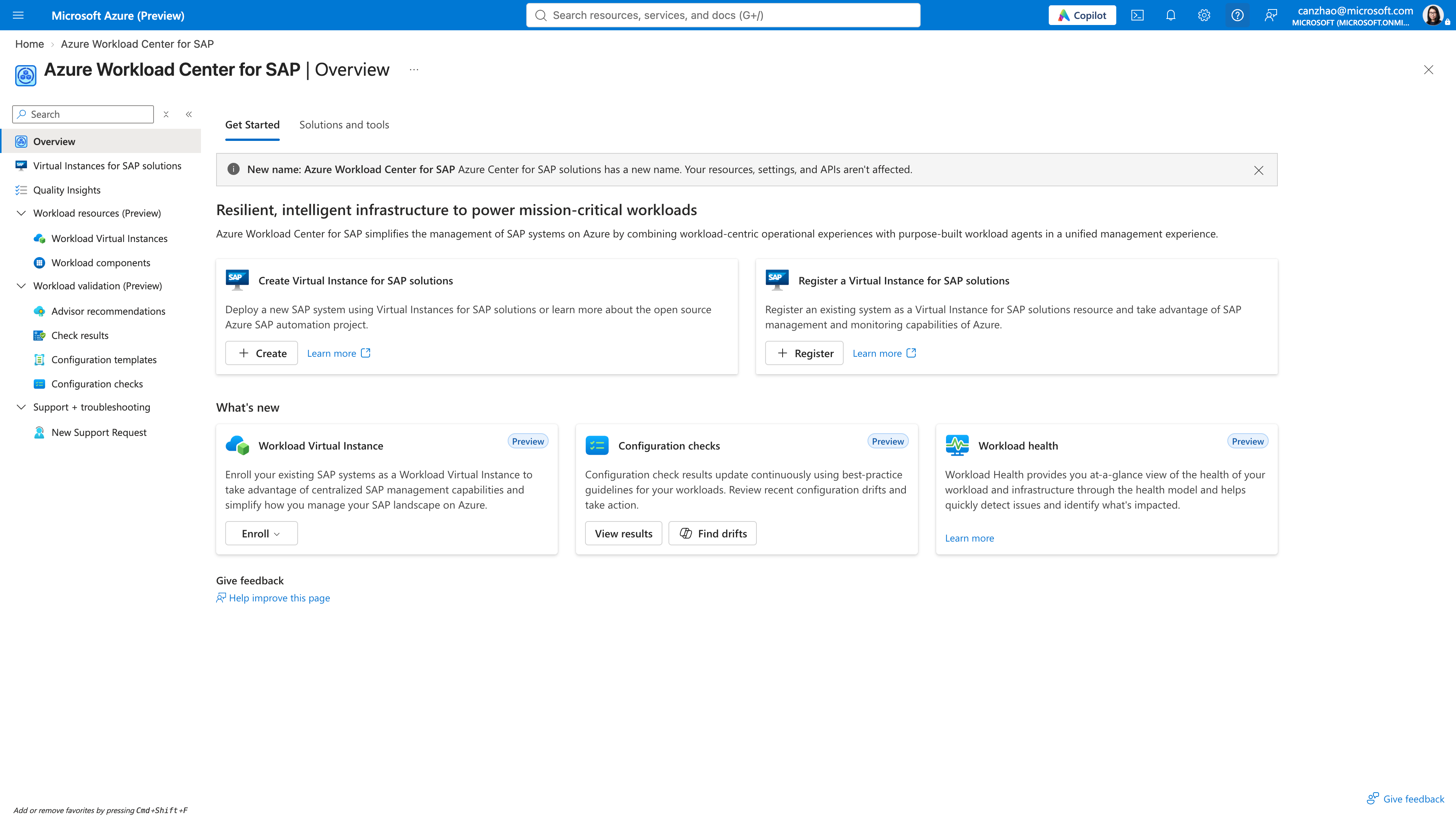
Reusable onboarding pattern shipped for SAP, Oracle & Epic · Redesigned Azure Resource Picker (framework component) · One of the first Azure partner teams to adopt Fluent 2 form components
My role
I owned the end-to-end UX for workload onboarding, resource discovery, and configuration validation/drift. I also drove the Fluent 2 modernization strategy across SAP, Oracle, and Epic, and explored how workload agents in Azure Copilot hand off to the Portal. I partnered with PM to scope releases, worked with engineering on feasibility, and worked with the Azure framework team to turn product needs into reusable platform components.
The problem
Azure organizes the world around infrastructure resources such as VMs, disks, networks, and databases. SAP, Oracle, and Epic operators think in systems: an SAP landscape is an application tier, a database, a message server, storage, and networking working together. Before Workload Center, customers had to rebuild that system context in their heads before they could reason about health or configuration.
Scale: Large estates contain tens of thousands of Azure resources, so identifying “what belongs to my workload” was hard and error-prone.
Risk: In one analysis of Epic support incidents, 46.5% (425 of 913) were caused by configuration issues.
Fragmented signals: Operators needed to get from “something is wrong” to the affected component, the evidence, and the next action.
Design challenge: How might we let customers model a mission-critical workload once, and then onboard, validate, monitor, and act on it as one system across both the Azure Portal and Azure Copilot?
The solution
Azure Workload Center gives enterprises one place in the Azure portal to onboard, monitor and operate mission-critical workloads such as SAP, Oracle and Epic. At its core is a Workload Virtual Instance (WVI) model that brings an application's servers, databases, and supporting infrastructure together into one view, so users can manage the whole system as a single unit, rather than as a collection of separate cloud resources.
Different workloads, different application structures
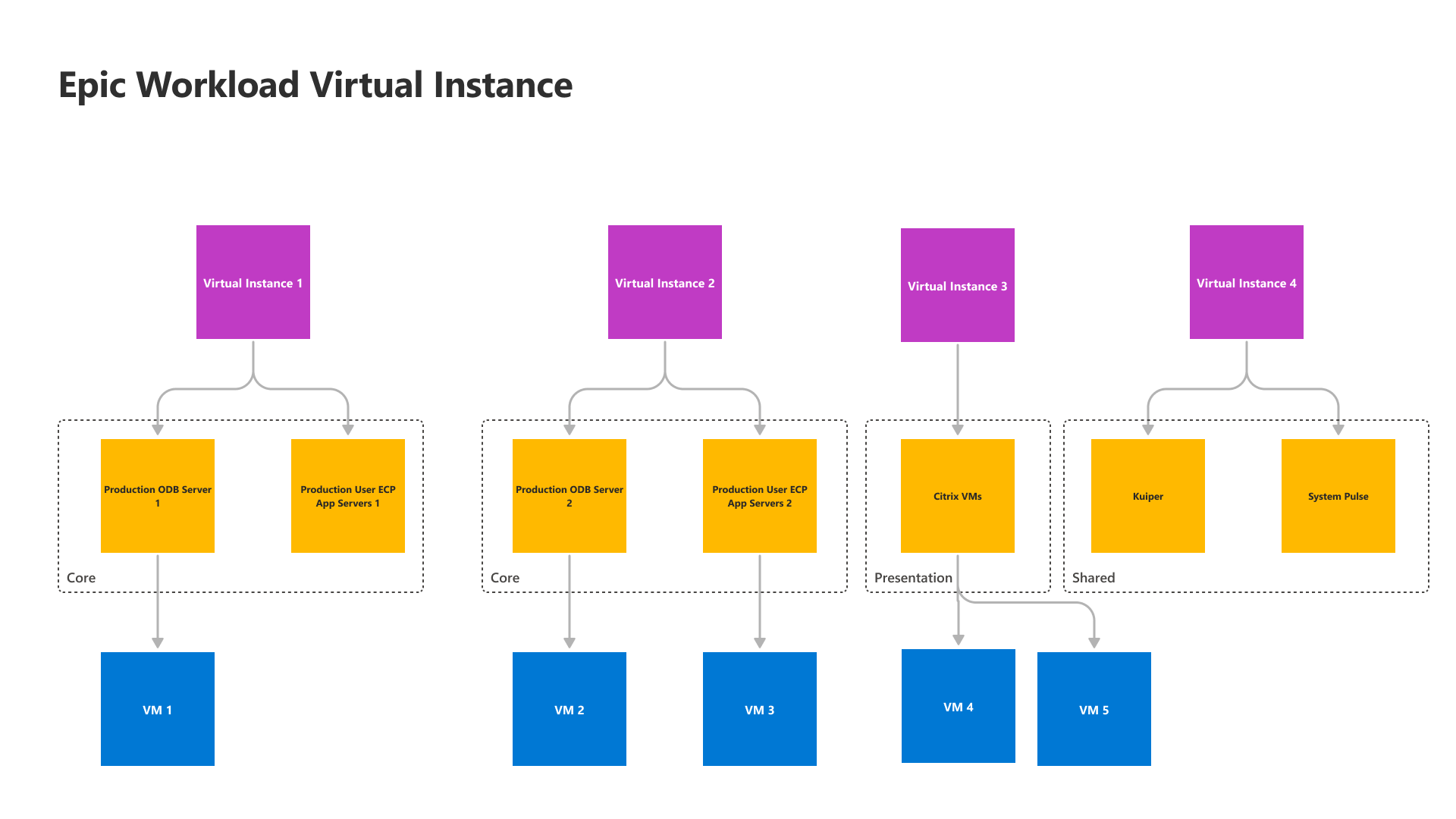
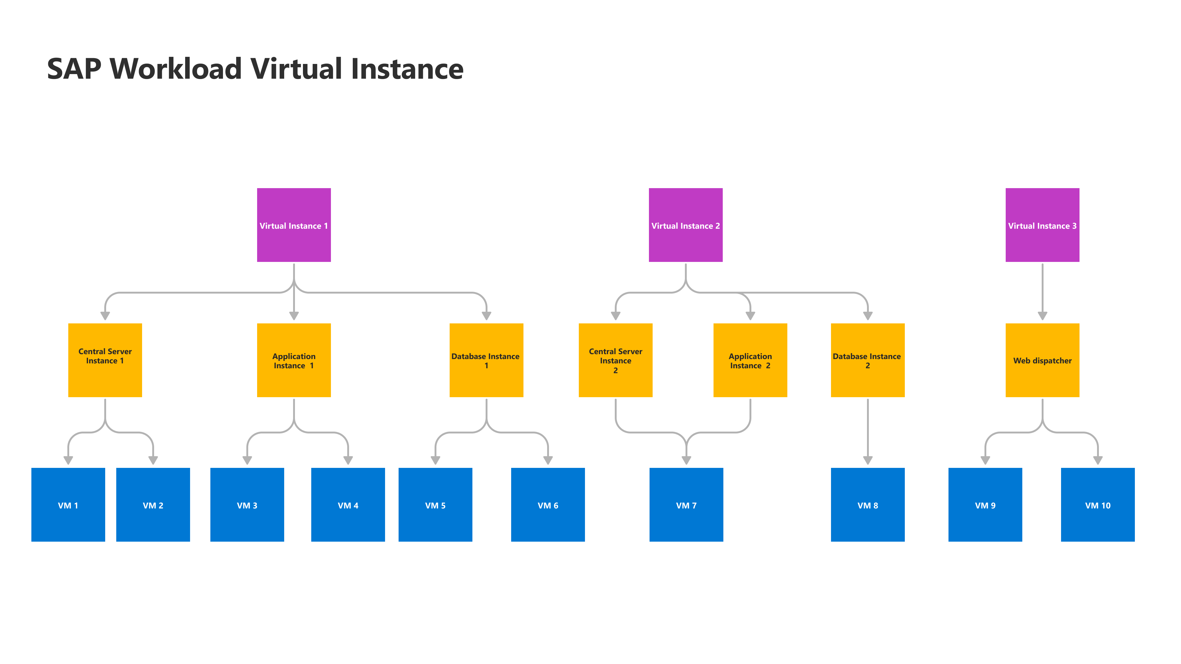
Mission-critical workloads do not share a single application structure. Epic groups components into core, presentation, and shared layers, while SAP models central server, application, database, and web dispatcher components. The Workload Virtual Instance (WVI) model preserves these workload-specific structures while mapping each component to its underlying Azure resources.
Epic WVI: core, presentation, and shared application layersSAP WVI: central server, application, database, and web dispatcher components
Users
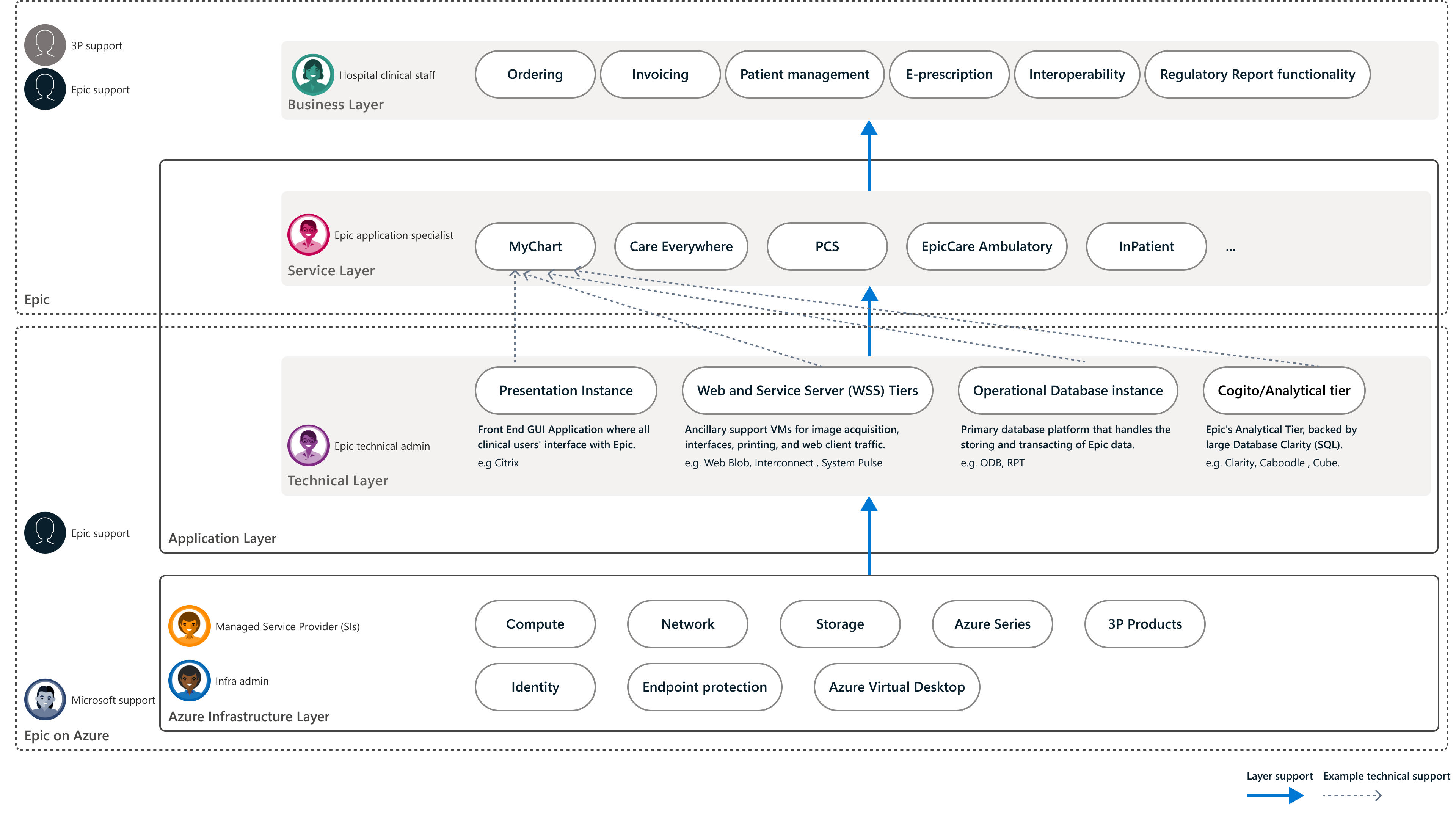
To understand the primary user roles, let’s start with the workload diagram, using Epic as an example. Clinical workflows at the business layer depend on Epic services, technical application tiers, and the underlying Azure infrastructure. Different people manage these layers, but operating and troubleshooting the workload requires them to work together.
Epic on Azure: the workload layers and the people who support them
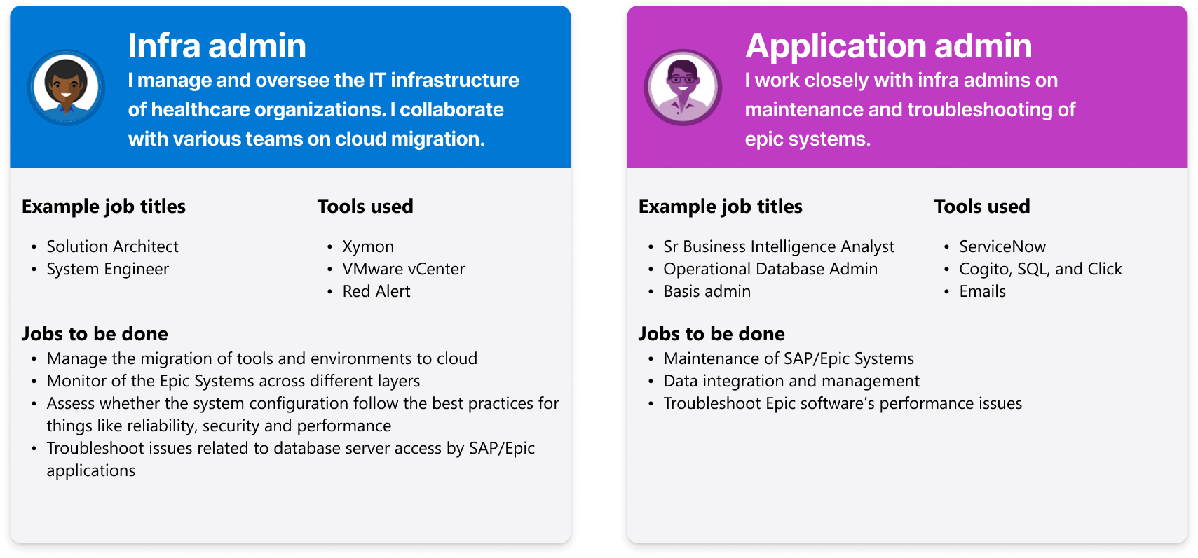
Two primary users: infrastructure and application admins
The diagram highlights two primary users for Workload Center. Their responsibilities sit at different layers, but they share the need to understand the health and configuration of the complete Epic workload.
Infrastructure admin: Manages the healthcare organization’s IT infrastructure and cloud migration. Monitors Epic across layers, assesses configuration against reliability, security, and performance best practices, and troubleshoots infrastructure and database-access issues.
Application admin: Maintains Epic systems, manages data integration, and troubleshoots application performance. Works closely with infrastructure admins to connect application symptoms to the underlying technical and infrastructure components.
Primary user profiles: infrastructure admin and application admin
Translating user roles into product responsibilities
These primary users can take on different responsibilities within Workload Center. I structured the experience around the task being performed, from defining the workload to validating its configuration:
Workload / system architect: Defines the workload architecture and its components.
Workload operator: Creates and manages workload instances day to day.
Check author: Defines custom configuration checks and templates.
Configuration operator: Runs validation, interprets results, and fixes drift.
Separating these roles, instead of designing for a single generic “admin,” shaped the information architecture, permissions, and the entry point for each flow.
Design process & iterations
Iteration 1: Simplify the architecture before raising fidelity
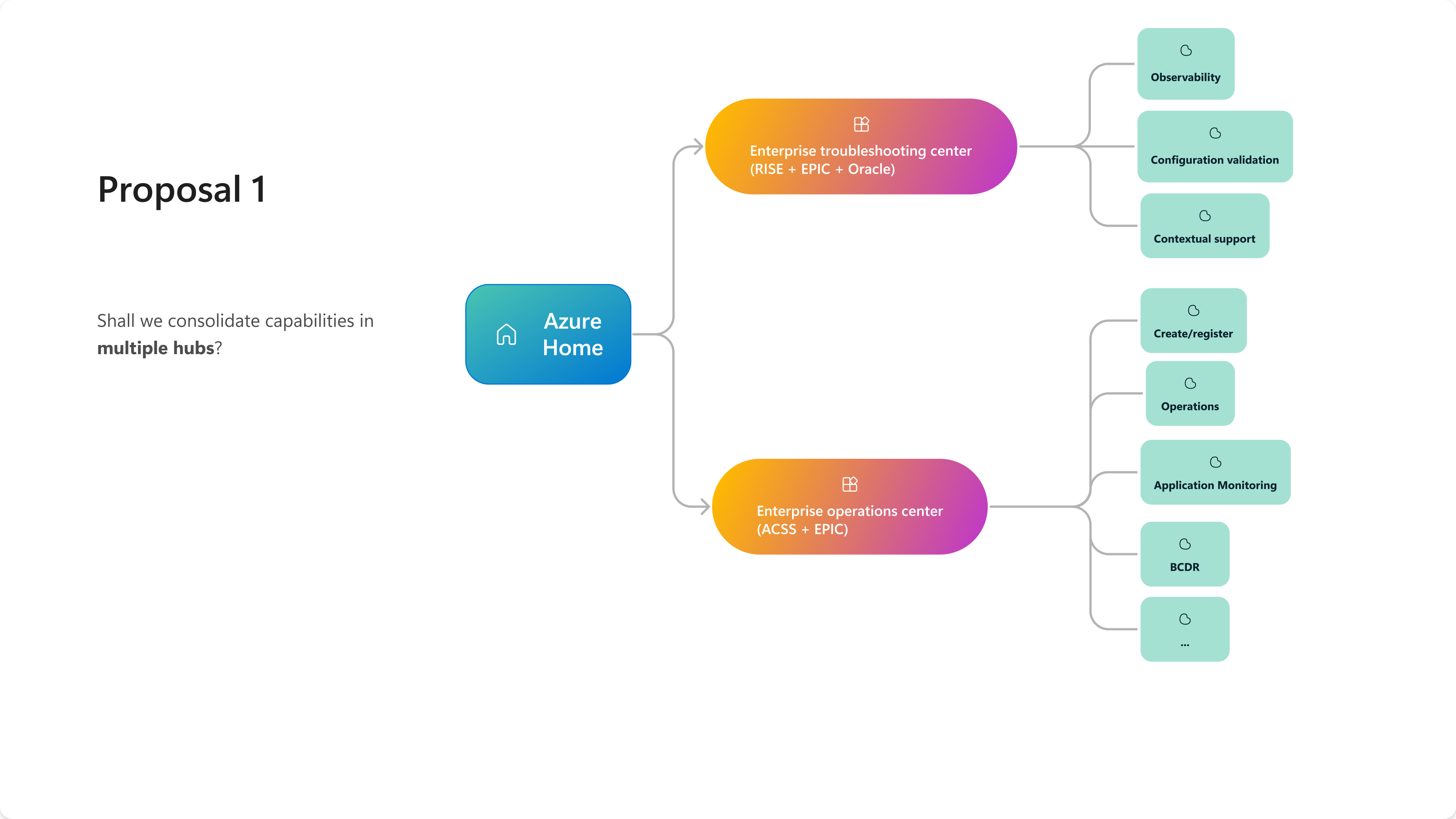
Before: The early concept split capabilities between an Enterprise troubleshooting center and an Enterprise operations center. Navigation was organized around product capabilities, and the dashboard changed depending on which capabilities were enabled. Customers would have to move between hubs to manage and troubleshoot the same workload.
Proposal 1: separate troubleshooting and operations hubs
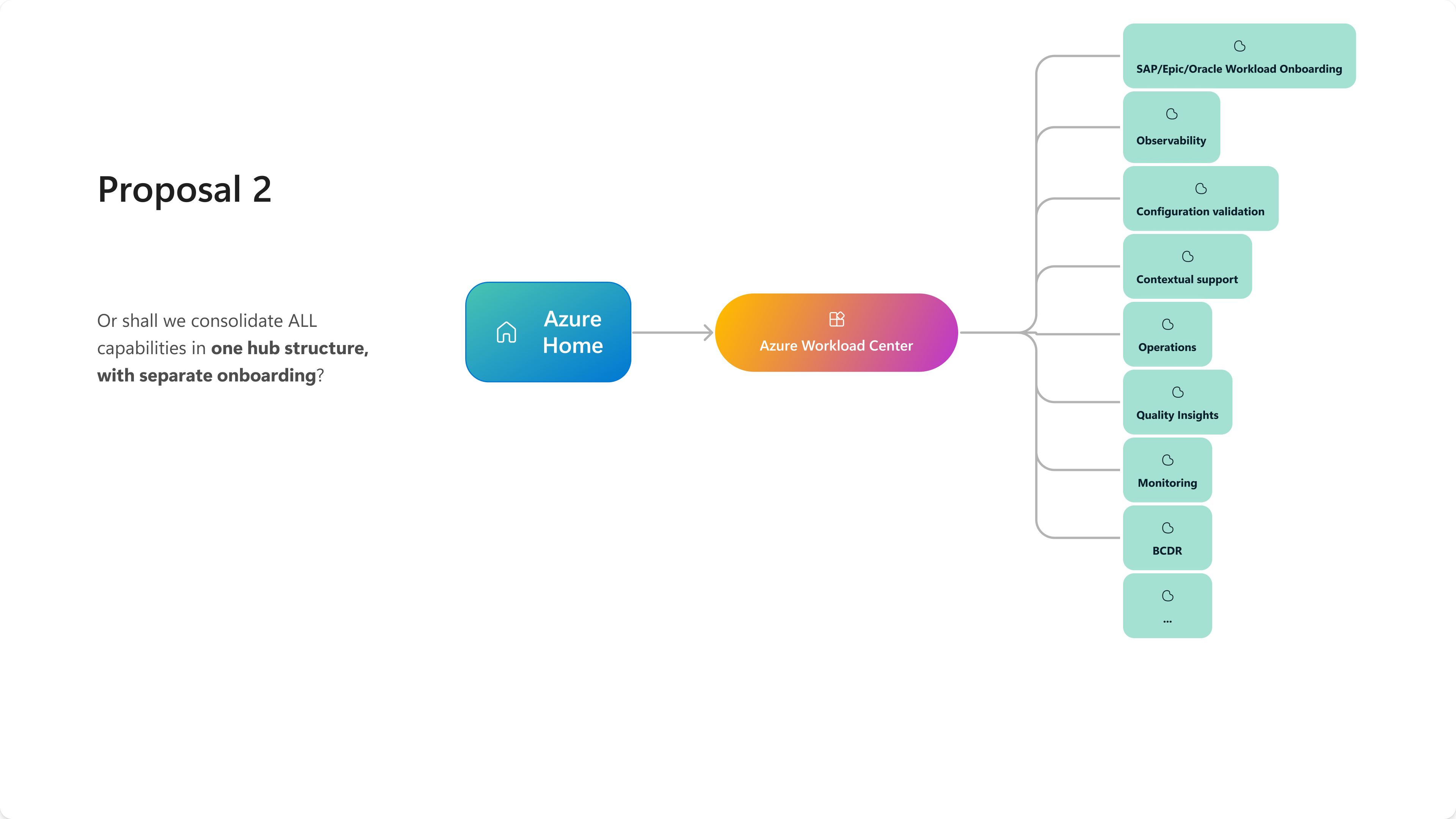
What we learned: Concept research confirmed the value but showed that two hubs split the mental model. I walked PM through emerging Azure hub patterns and helped the team align on the table-of-contents structure. I also explored a single Azure Workload Center entry that consolidated all capabilities with separate SAP, Epic, and Oracle onboarding. This brought the capabilities together, but the structure still needed to make the customer's workload context explicit.
Proposal 2: one generic hub with consolidated capabilities and separate onboarding
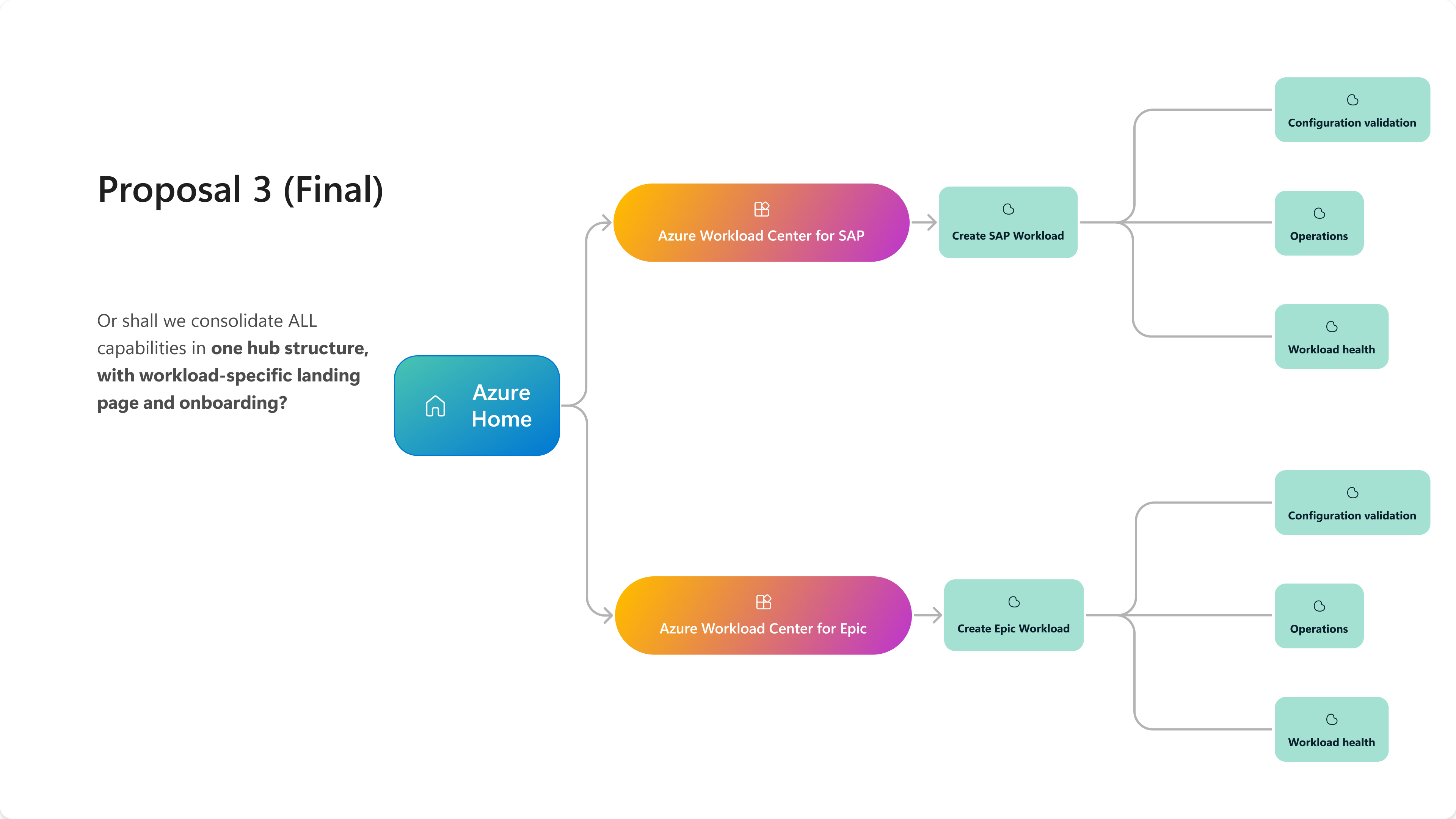
After: A shared hub structure with workload-specific landing pages and onboarding for SAP and Epic. Each workload entry brings configuration validation, operations, and workload health together, rather than separating management from troubleshooting. I created the Workload Virtual Instance (WVI) object diagrams and the Portal navigation for SAP and Epic, which we then used in design-partner sessions.
Why it matters: We standardized the hub structure without flattening the differences between mission-critical workloads. Customers enter through the workload they recognize, then manage and troubleshoot it in one coherent experience. Fixing this structure first gave the later screens a clear foundation.
Iteration 2: Onboarding: from tag scans and CSVs to a reusable Fluent 2 wizard
Before: The first private preview mapped resources through tag-based scanning and CSV upload. It worked, but it was brittle, and the experience was specific to each workload.
What we learned: Users needed confidence that the whole environment was captured, and engineering needed something they wouldn’t rebuild for every workload. Environment and lifecycle fields were also overloading the Basics step.
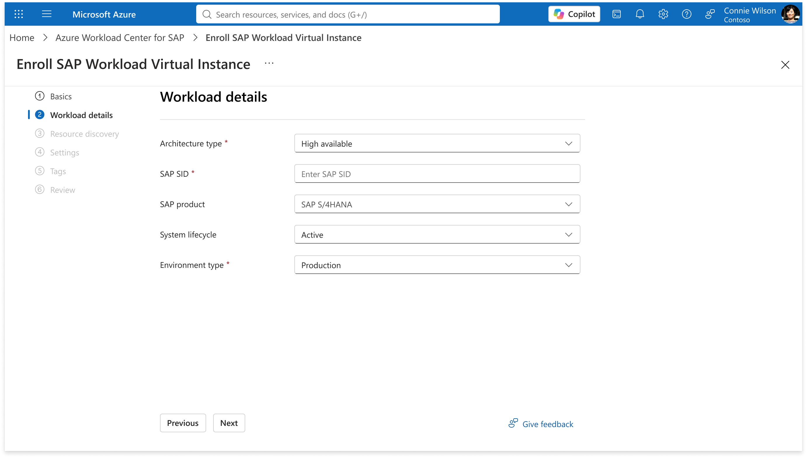
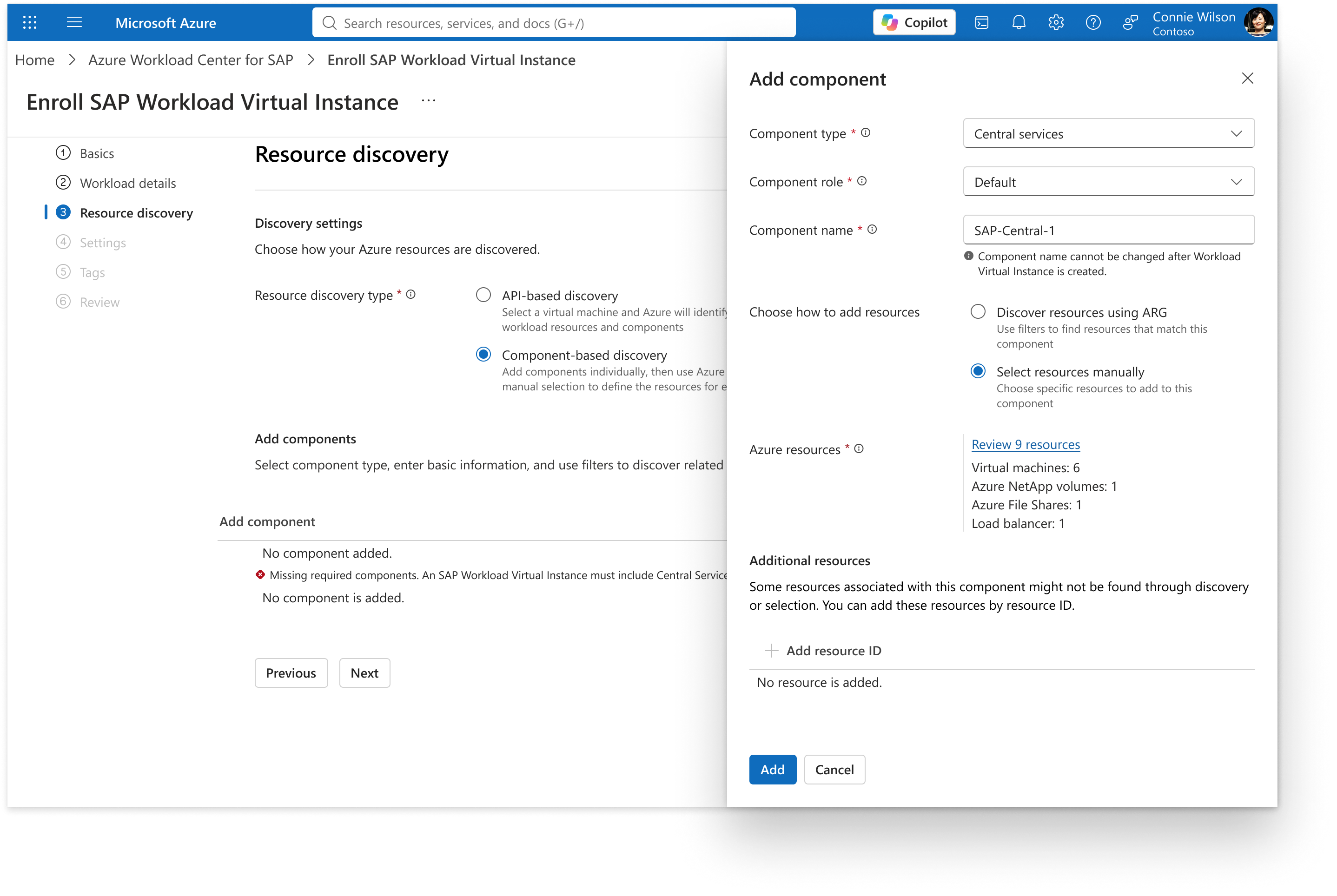
After: A sequential Fluent 2 wizard with these steps: Basics (with inline preview consent) → Resource discovery → Component mapping → a dedicated Metadata step → Review. Forward navigation is disabled until each step is valid. I designed it as a configuration-driven pattern that works for any workload.
Why it matters: The same metadata-driven pattern shipped for SAP, Oracle, and Epic. The Oracle team launched faster because they reused SAP patterns instead of starting from scratch.
The SAP example below separates defining the workload from identifying its infrastructure. Users first specify the architecture, SAP system details, lifecycle, and environment, then discover Azure resources and map them to the workload’s components.
SAP onboarding: define the workload architecture and system detailsSAP onboarding: resource discovery and component mapping
Iteration 3: Redesigning the Azure Resource Picker (a framework contribution)
October 2025 · AI-assisted prototyping pilot
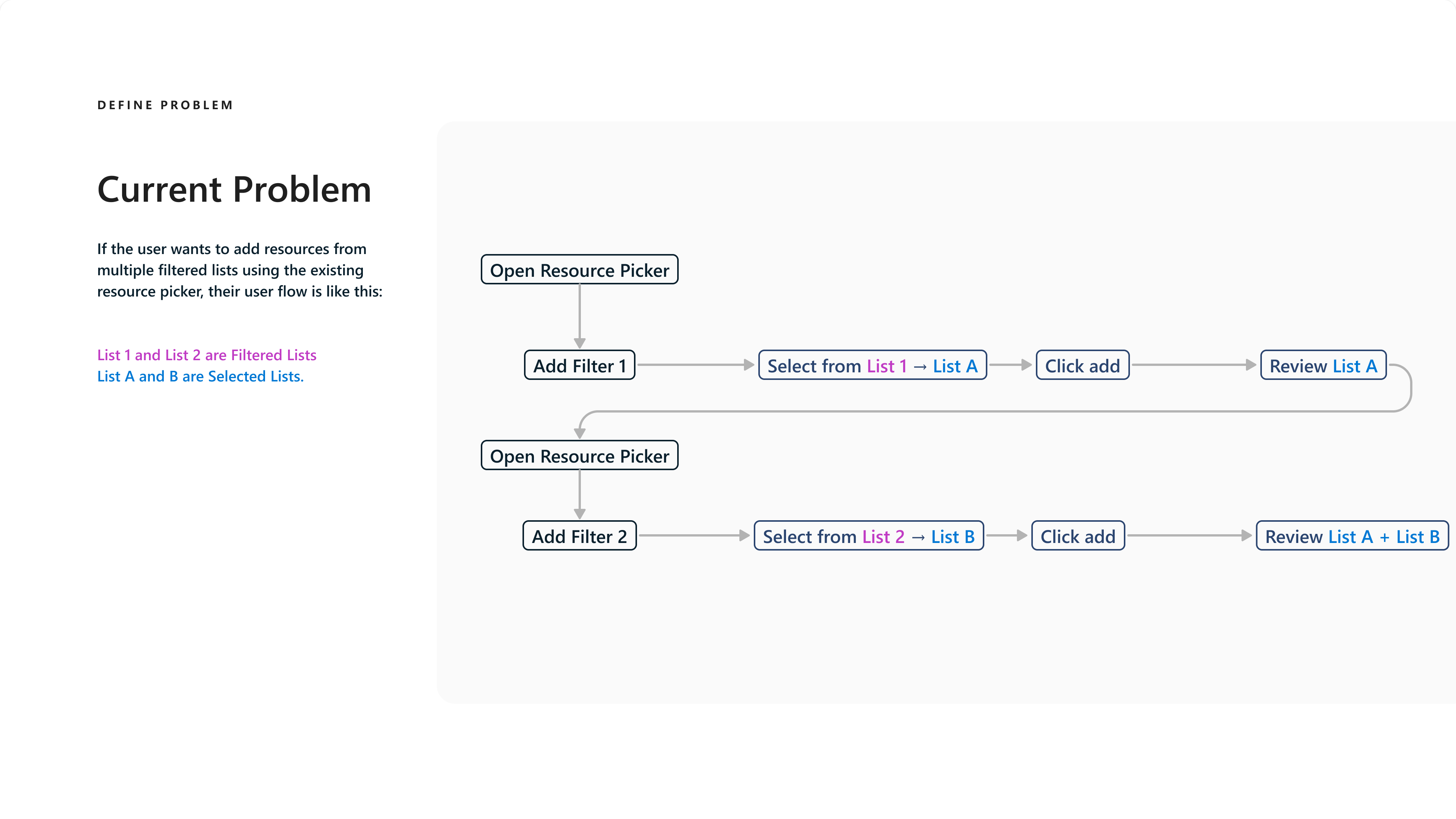
Before: The existing Azure Resource Picker made it hard to keep track of previous selections when filters changed. To collect resources from multiple filtered lists, users had to reopen the picker and repeat the add-and-review cycle. Users building a component across several filter combinations couldn’t confidently see what they had already selected.
Existing workflow: repeated add-and-review cycles across filtered lists
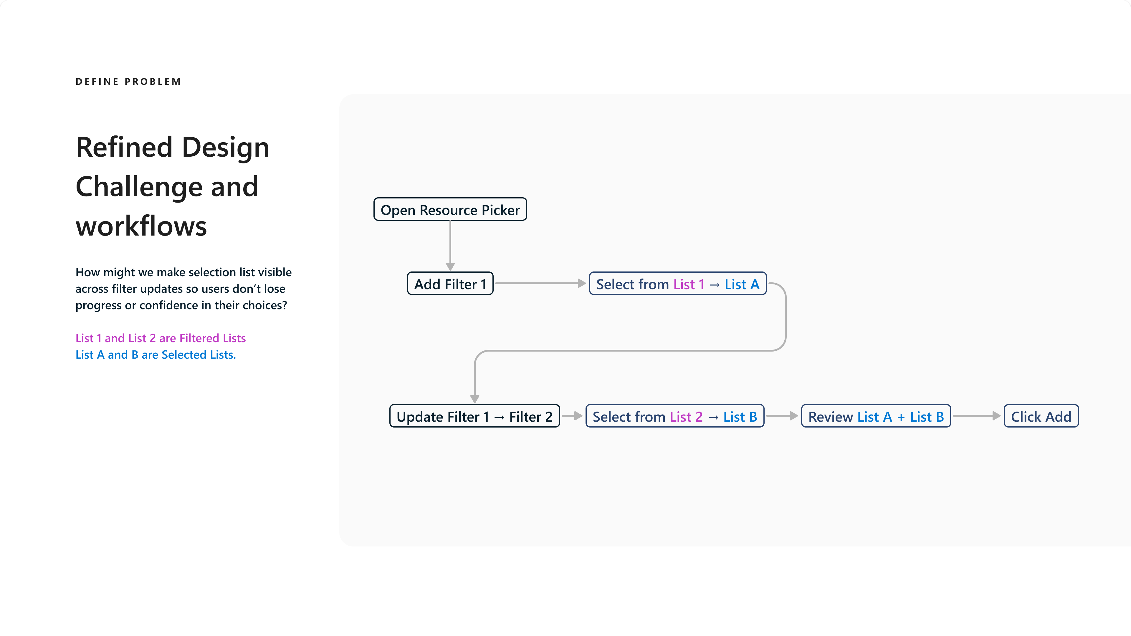
What we learned: Rather than build a one-off workaround, I explored a redesign of the framework component. In October 2025, I piloted Figma Make as an AI-assisted tool for creating interactive prototypes for user testing. Within a week, I built two concepts, then partnered with UX research to run Loop Lab usability testing with 10 participants. The design challenge was to keep selections visible across filter updates so users would not lose progress or confidence in their choices.
Refined workflow: update filters without losing track of the combined selection
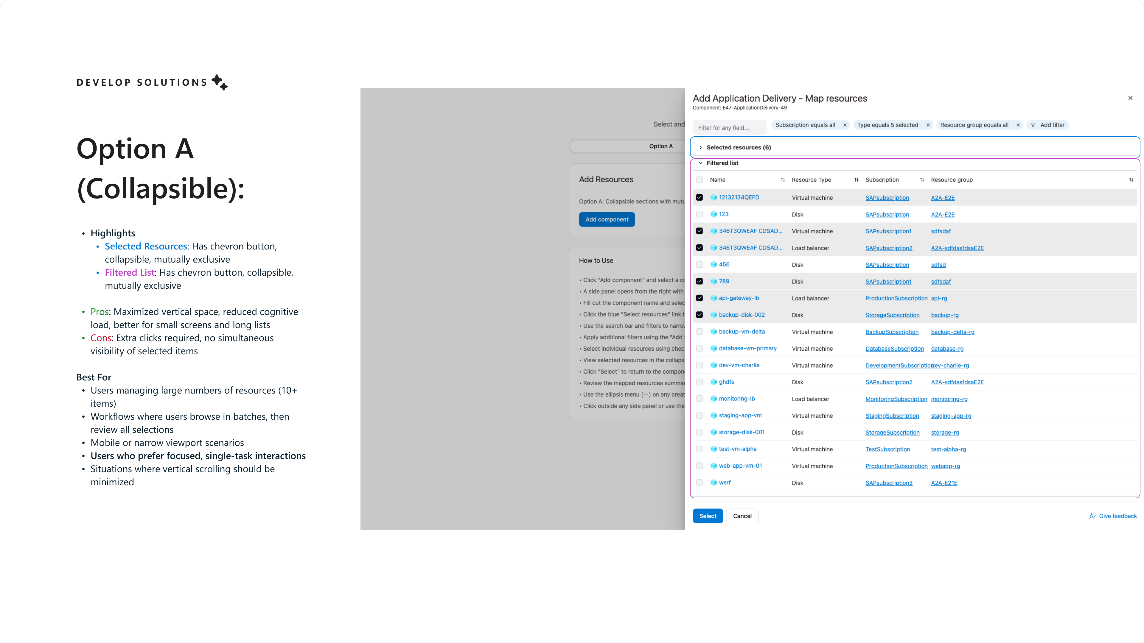
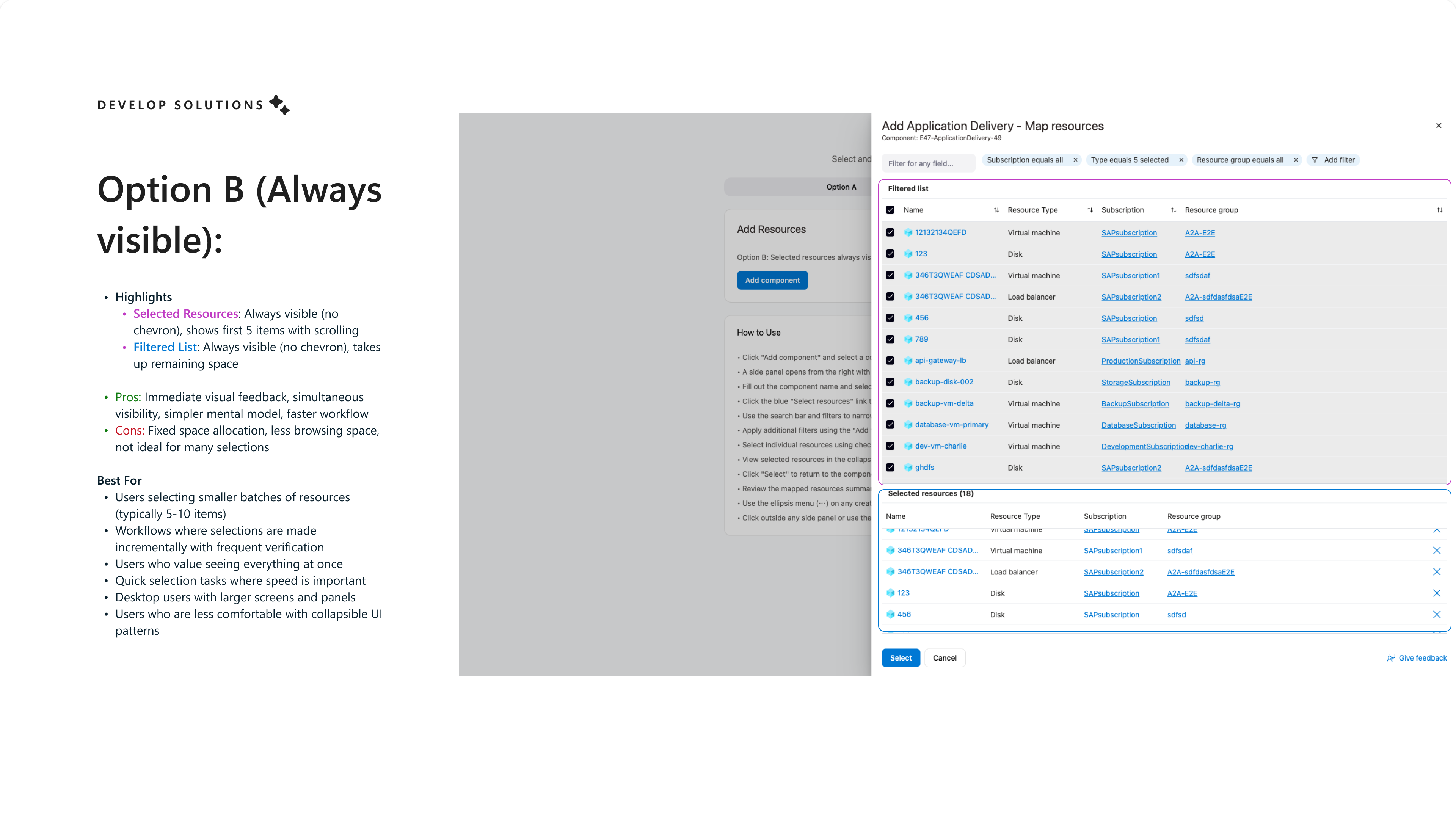
I used the prototypes to test two approaches to selection visibility. Option A used collapsible filtered and selected-resource sections to preserve browsing space. Option B kept both lists visible, trading some browsing space for simultaneous selection feedback.
Option A: collapsible sections for focused browsing and selection reviewOption B: filtered and selected-resource lists always visible
The user feedback favored Option A and gave me specific direction for refinement:
Filters and selection review: Participants appreciated the location and availability of filters, along with Option A’s collapsed view of selected items.
List hierarchy:4/10 participants wanted the filtered list above the selected-resources list. They saw making selections as the screen’s primary action and wanted the resources available to select to be visible first.
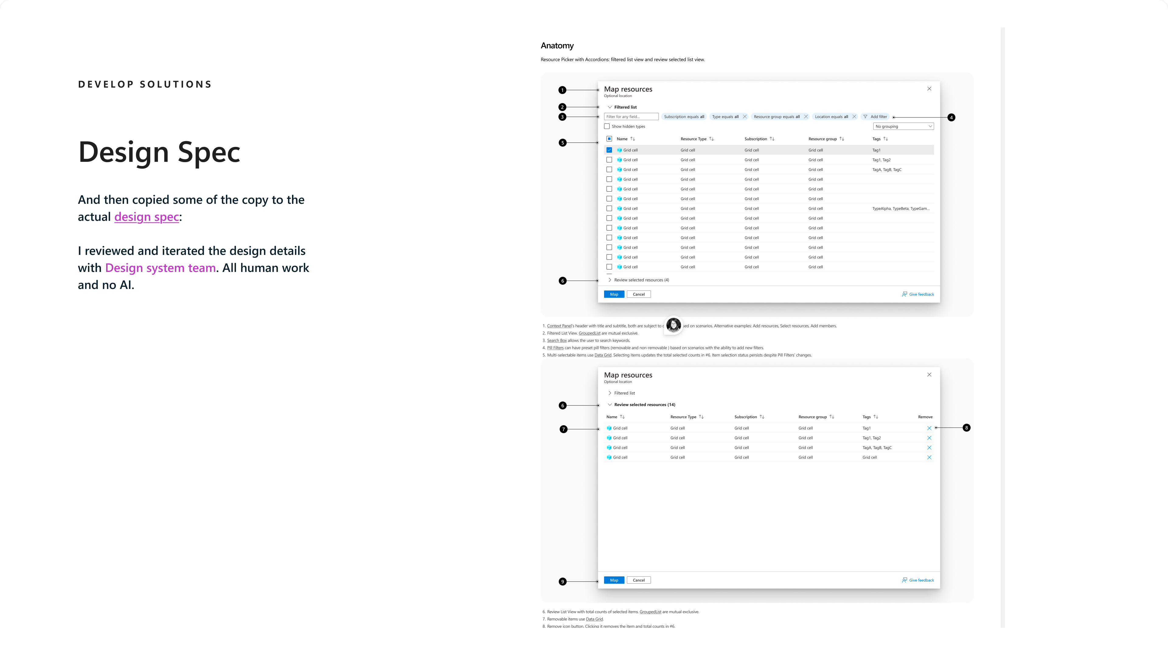
After: I landed on Option A and refined it using this rich user feedback: the filtered list comes first, with a collapsible selected-resource review below it. I then partnered with the Azure framework designers to turn the chosen approach into a formal framework specification. Figma Make accelerated the prototypes and testing; the final specification and detailed design review were human-led, not AI-generated.
Final framework specification: Option A refined through user feedback and design-system review
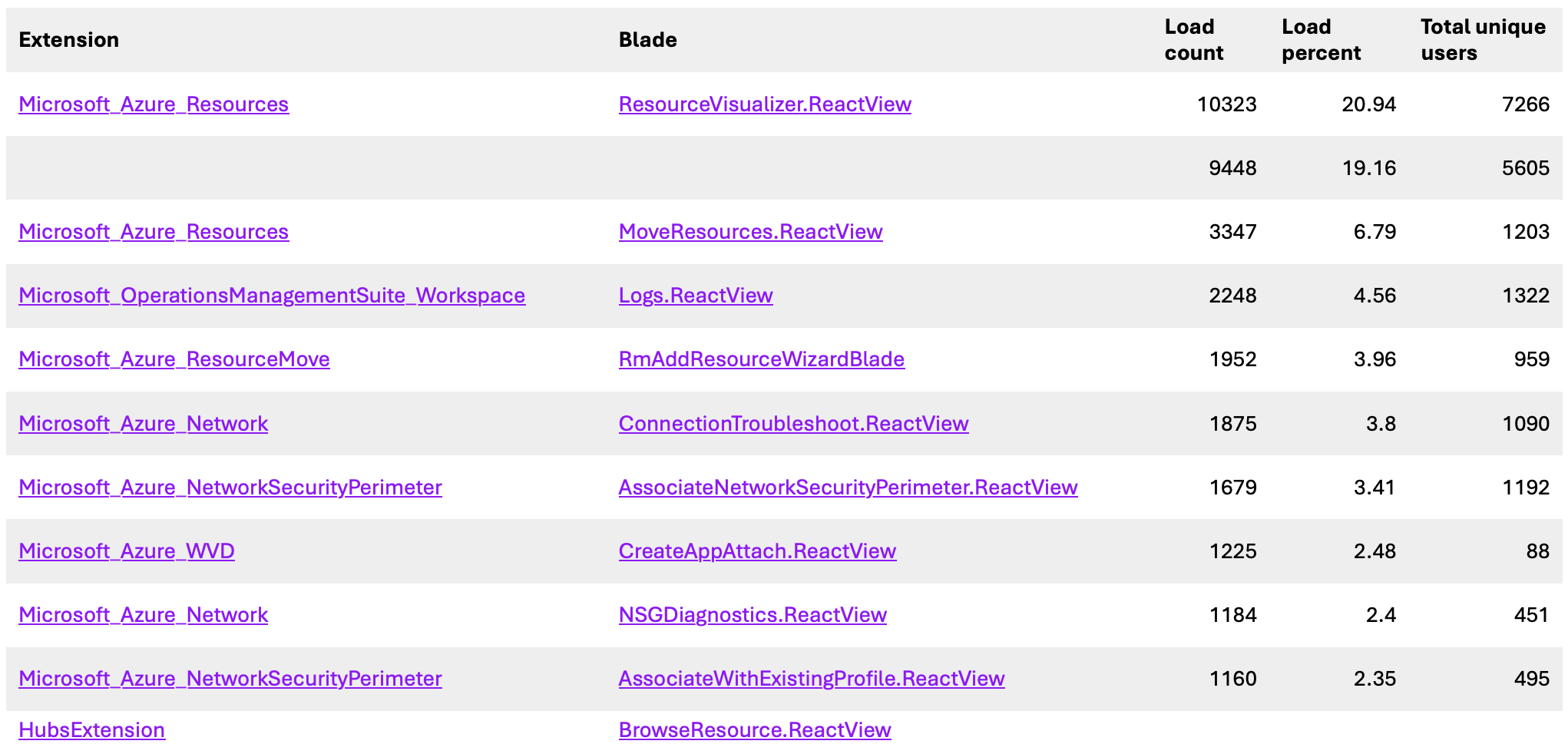
Why it matters: The AI-assisted pilot helped me move quickly from a product-specific blocker to testable alternatives, while research—not the tool—determined the direction. The redesigned Resource Picker shipped as a reusable Azure Portal component, unblocking manual Azure resource selection in my team’s onboarding flow and our public preview. Its impact now extends across 10 Azure services, with the framework component available for reuse by all Portal teams. I later presented this process as the first CXS “Design with AI” talk.
Resource Picker impact: usage across Azure service experiences
Iteration 4: Configuration validation: making “Skipped” understandable
Before: An activity view showed checks as Passed, Failed, or Skipped. Successful checks were mixed into the recommendations view.
What we learned: In usability testing with 5 infrastructure/Basis admins, “Skipped” confused people, the disable-check terminology was unclear, and participants wanted focused recommendations along with history, rollback, and better template control.
After: I reframed the model around applicability. The workload shows Applicable and Not applicable checks, with a reason for each (e.g., OS mismatch, missing metadata, absent component). I also designed a check → template → workload model in which editing an applied check never changes the master definition, and a date-based status-history timeline that separates real execution results from periods when a check was disabled.
From design to engineering: I used VS Code to vibe-code this interactive prototype, directly consuming the design-system package and its components rather than recreating the UI. This kept the prototype aligned with the design system and enabled precise, fast design delivery to engineers.
Why it matters: A confusing system state became a relationship users could reason about: “this check doesn’t apply to this workload because…”
Iteration 5: Hub overview: from action-first to signal-driven
Before: The hub led with entry points and “Top Actions.”
What we learned: Research synthesis showed users didn’t trust recommended actions when the signals behind them were hidden. Earlier participants had also asked for graphs, topology, and statistics on the overview.
Exploring the signals in code: I also used VS Code to experiment with different data-visualization formats and interaction patterns using @fluentui/react-charts. These coded experiments helped me explore how to make multiple dimensions of configuration deviations across Workload Virtual Instances (WVIs) easier for users to understand, rather than reducing them to a single summary status.
After: A lifecycle-based hub organized as Discover & Commit → Manage & Optimize. Actions come from visible health, configuration, and impact signals, and users can drill down from workload → category → component → resource. We shipped a static Fluent 2 overview for Ignite and defined a dynamic, signal-driven overview as the north star.
Why it matters: Users see why before being asked to act, which builds trust in recommendations.
Iteration 6: Agentic UX: knowing where chat should stop
Before: We explored a conversational onboarding agent in Azure Copilot. I built a coded prototype and iterated on its instructions and response consistency. Early drift-agent responses were long and hard to scan.
What we learned: Reliability wasn’t good enough for a high-control setup workflow, and dense configuration data didn’t belong in chat.
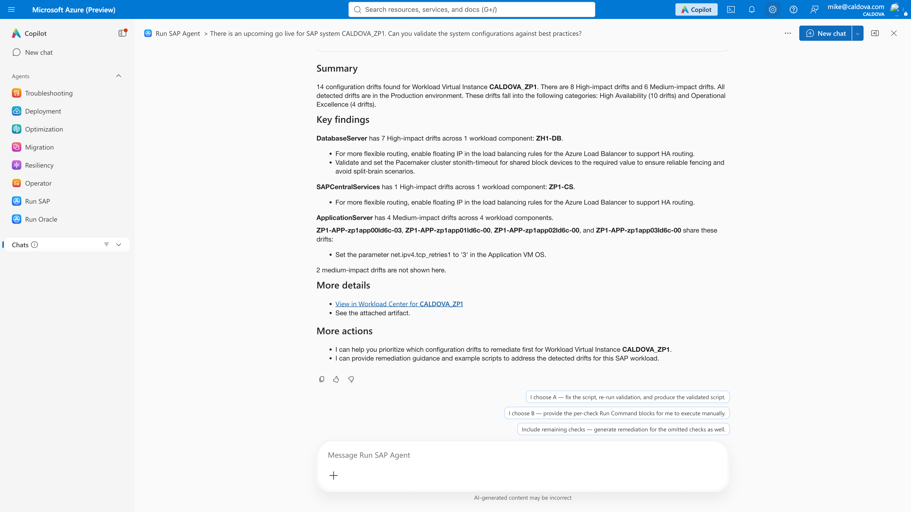
After: I removed the unready “Onboard with Copilot” entry point instead of shipping it to meet a date. I defined Agent-to-Portal handoffs, where agents summarize and deep links open deterministic Portal views. For drift responses, I led five iterations toward a rule-based hierarchy: Summary → Key findings → Details → Next steps. Results are ranked production-first and by impact, show how many items are displayed vs. omitted, and are grouped by component type.
Why it matters: The agent became a decision-support layer rather than a replacement for the full dataset, which protected user trust.
Structured drift-agent response: summary, key findings, details, and next actions
Outcomes
Shipped: SAP private preview (registration + configuration validation), followed by Epic. In June 2026, SAP got the new onboarding experience and Oracle launched its own Workload Center.
Platform reuse: The configuration-driven onboarding pattern replaced workload-specific UX across SAP, Oracle, and Epic, which reduced duplicated engineering.
Framework contribution: The redesigned Azure Resource Picker shipped as a shared framework component, unblocked manual Azure resource selection in our onboarding flow, and now impacts 10 Azure services. It is available for reuse by all Portal teams.
Design-system leadership: We were one of the first Azure partner teams to adopt the Fluent 2 form components.
Recognition: I was named UX owner for Foundation (onboarding & change detection) and Configuration validation/drift for Ignite, and moderated the end-to-end experience walkthrough.
Reflection
The thread through this project was turning workload-specific problems into reusable Azure platform patterns. Research and engineering constraints helped me decide what to standardize, what to keep workload-specific, and what to defer rather than ship poorly. If I did it again, I would set up success metrics (e.g., onboarding completion and time-to-first-validation) earlier so the impact of each iteration could be measured.